Budget Bounce
New Personal Finance Management Features for the current app
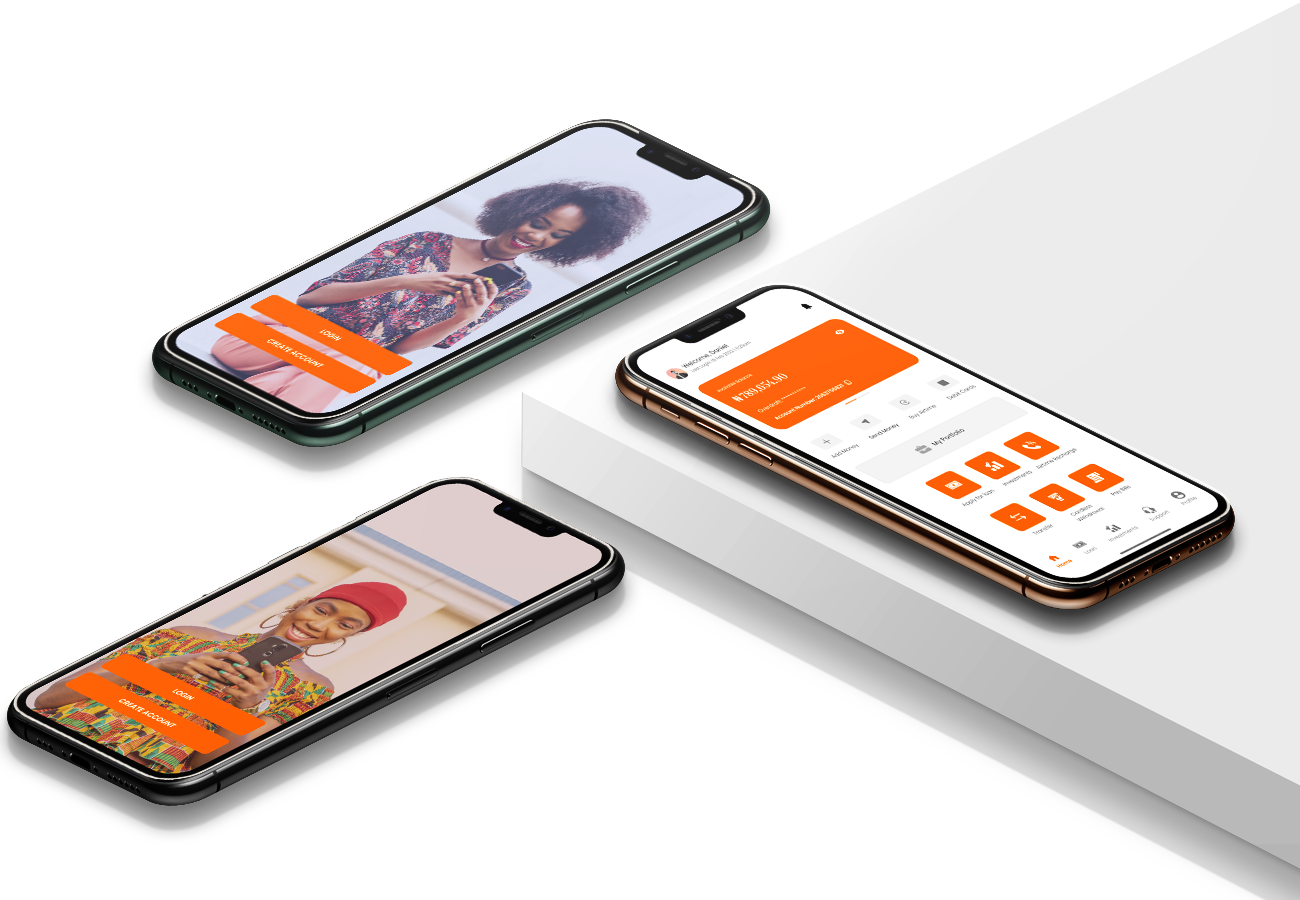
Budget Bounce was founded in 2015 by two former college roommates who wanted a better way to pay each other back. What started off as a simple SMS platform to send and receive money has evolved into a social payments app allowing people to split bills, pay each other back for rent, and make purchases at approved merchants.
They have put a lot of effort in providing a seamless experience through its current features, but now they want to go beyond and not just provide these functions, but also tools to help them manage money better. Seeing an opportunity to make a difference and help Millennials with their financial challenges, they now want to develop typical personal finance management features include saving goals, budgets, calculators, and expense tracking.
Figma, Adobe Illustrator, InVision, Zeplin
Product Designer (Researcher, Visual, Graphics & Interaction Designer & Quality Assurance)
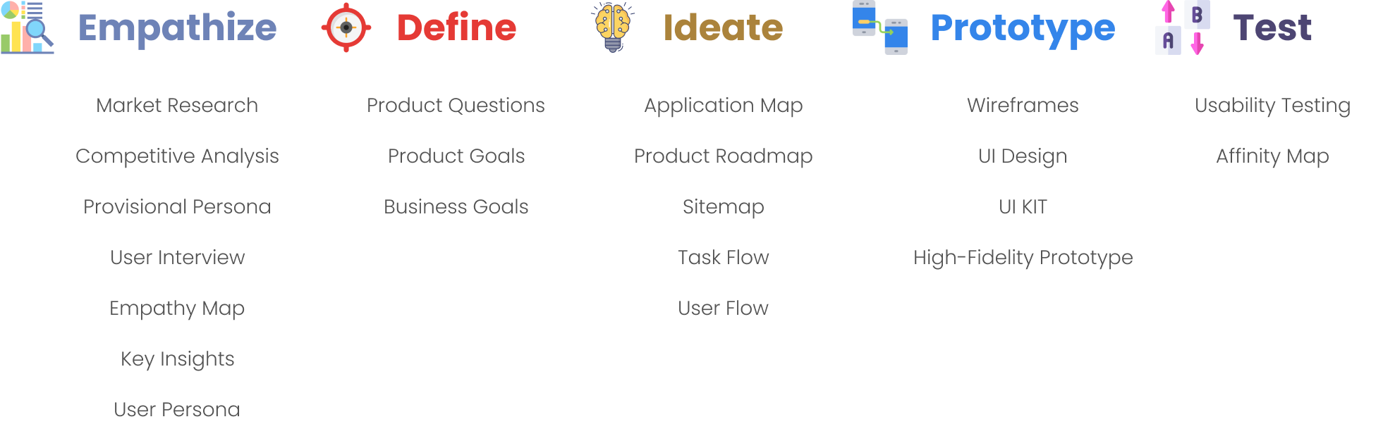
Research 3 weeks | Interaction Design 2 weeks | Prototype 1 week
This involves understanding the needs, wants, and behaviors of the user for whom the product or service is being designed. It involves conducting research, such as interviews, observation, and surveys to gather insights and understand the user's perspective.
To ensure the research stays on track and better guide the design decisions later, it is important to create a research plan before diving into the research phase. I listed research goals, research questions, assumptions, methodologies, participants, and timeline in my research plan.
It is important to get a big picture of the market by starting with market research - to get a sense of what we know and don't know yet, who the audience are, as well as what the recent trends or news are. The insights we gathered from market research will help me frame provisional personas and ask meaningful questions in primary research.
As I am designing personal finance management features for a P2P payment software, I started to gather some knowledge of the market on both ends. I then dived deeper to know different aspects of Budget Bounce, including its users, features, and operations. Finally, based on the demographic knowledge I gathered when researching Budget Bounce, I looked into the spending habits and personal finance management of that specific population.
Users/Accounts
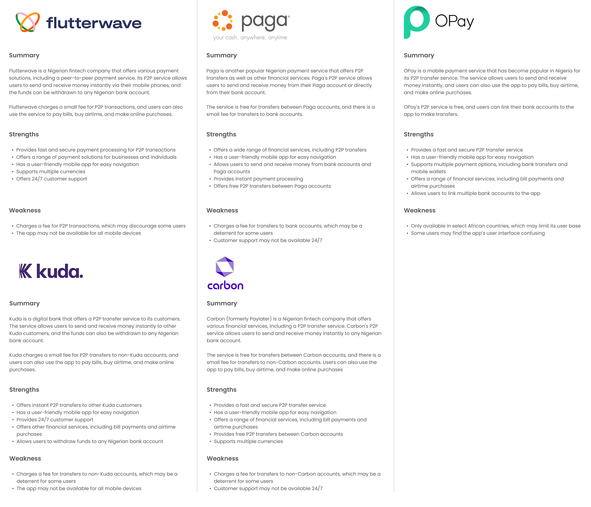
It is equally important to research other P2P payment apps, as their strengths and weaknesses will not only shed light on the key areas we should strive to maintain the high quality, but also help me identify any opportunities for Budget Bounce to emphasize. Based on the knowledge I gathered from market research, I analyzed 3 direct competitors as shown below, who are major P2P payment service providers, and 2 indirect competitors, who integrate P2P payment features into their service. A complete competitive research can be viewed here.
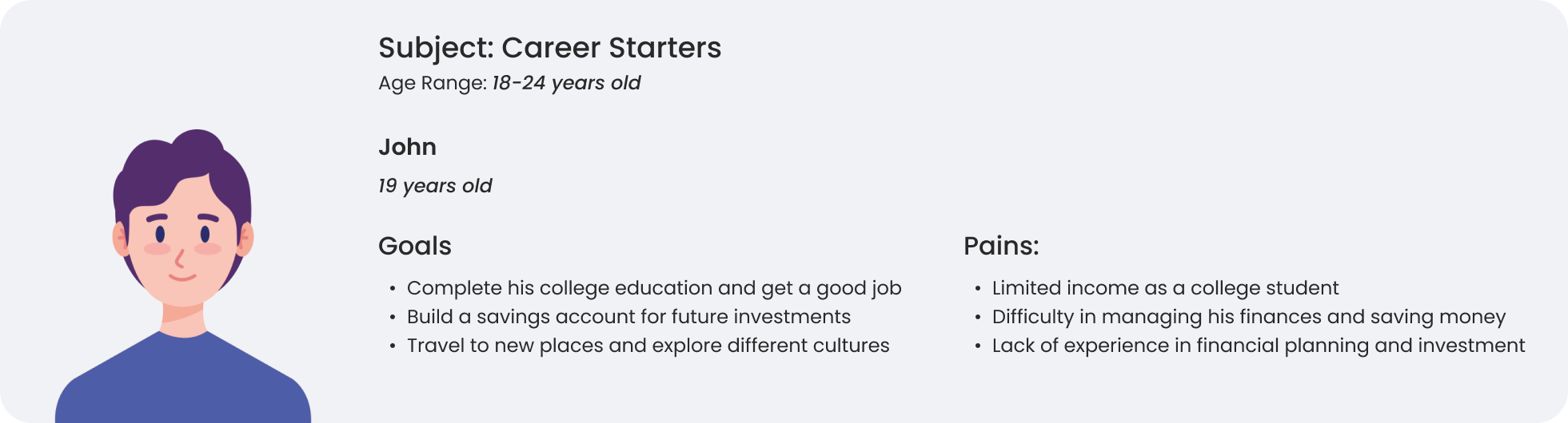
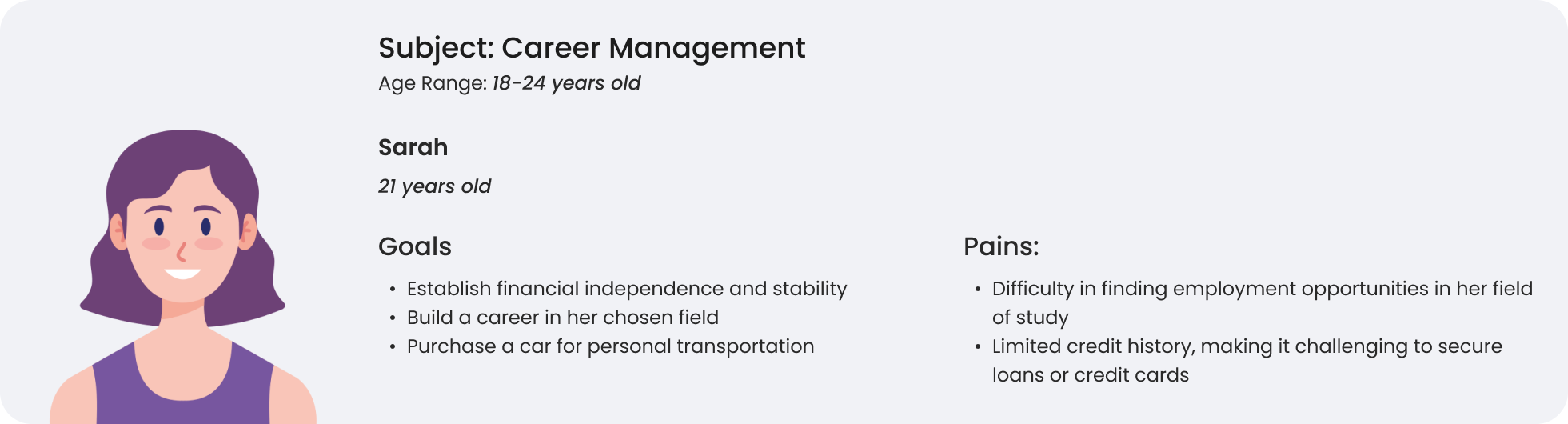
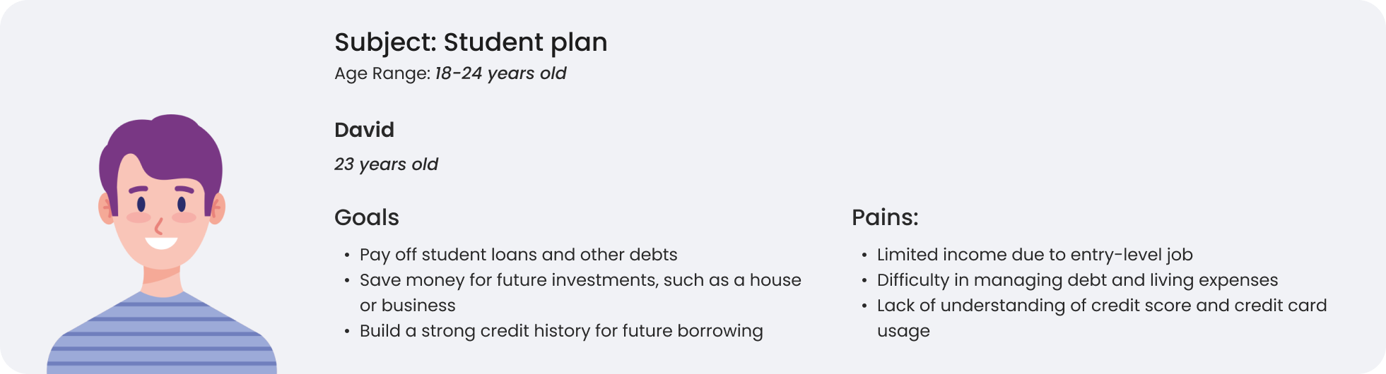
With the data gathered from market research, I started to generate provisional personas using the statistical and behavioral knowledge I gained to represent a certain type of user that are potential audience of Budget Bounce. These personas will help me screen appropriate people to interview.
An empathy map for a P2P (peer-to-peer) financial application would focus on understanding the user's needs and experiences. It is a visual representation of what a user is thinking and feeling, what they see, hear, say, and do in relation to a specific product or service. The empathy map is divided into four quadrants:
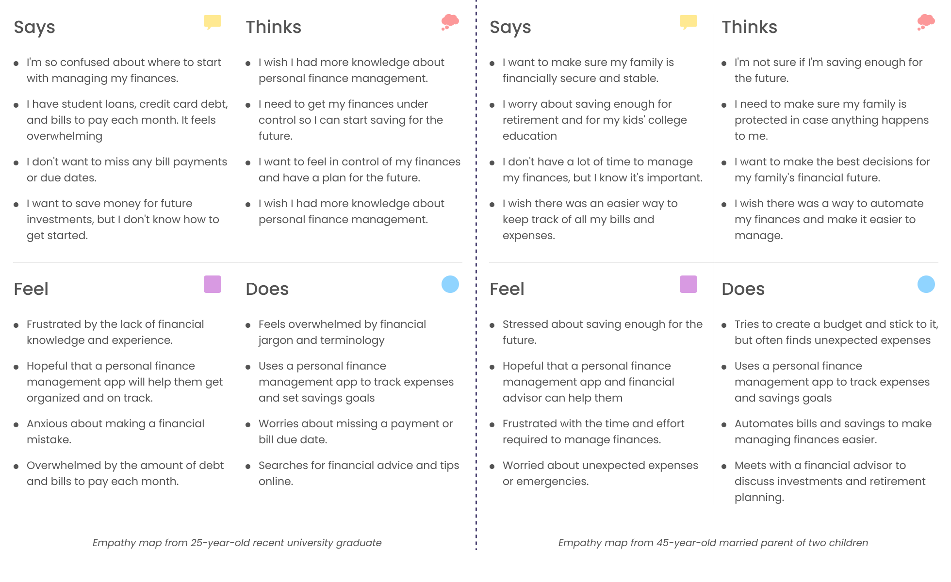
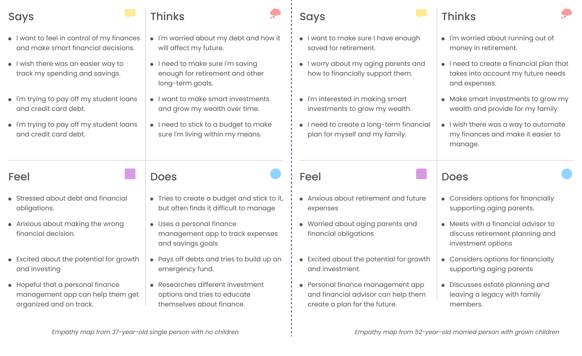
From the empathy maps listed above, some common takeaways for a personal finance management application could be:
To synthesize the qualitative data gathered from user interview, I created an empathy map to identify patterns across users, uncover insights, and generate needs. See a larger version of empathy map here.
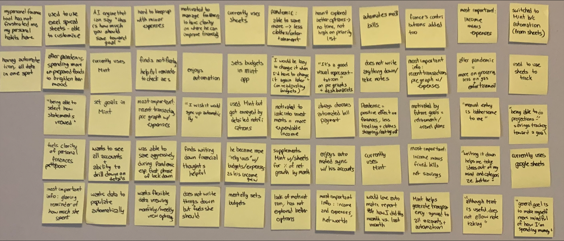
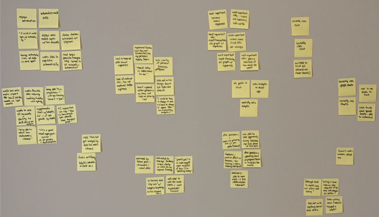
I wrote key quotes onto post-it notes and stuck them on a wall. I organized them into groups based on the themes they touched on.
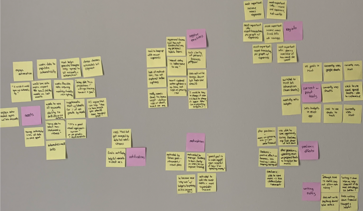
Based on the empathy maps and survey results related to personal finance management applications, some key insights & needs include:
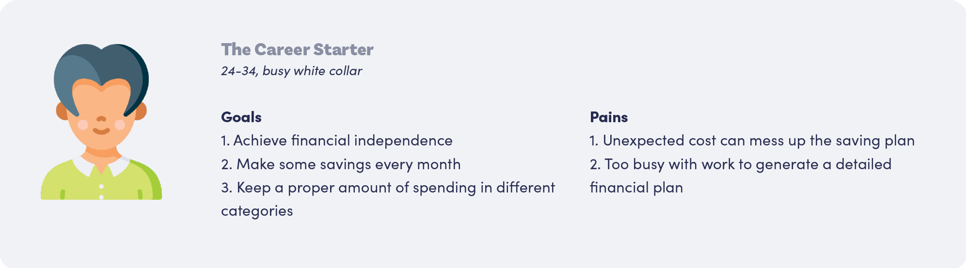
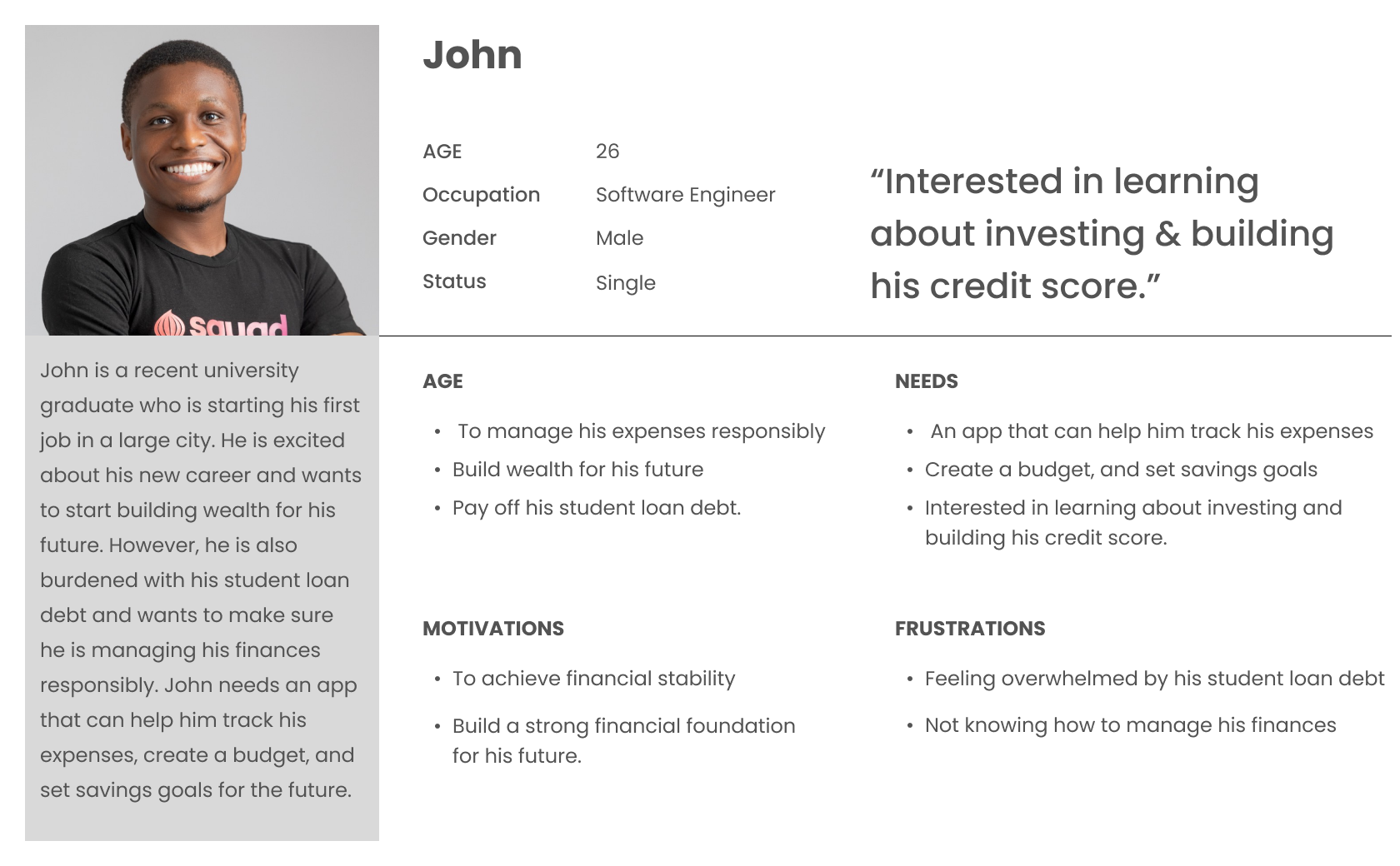
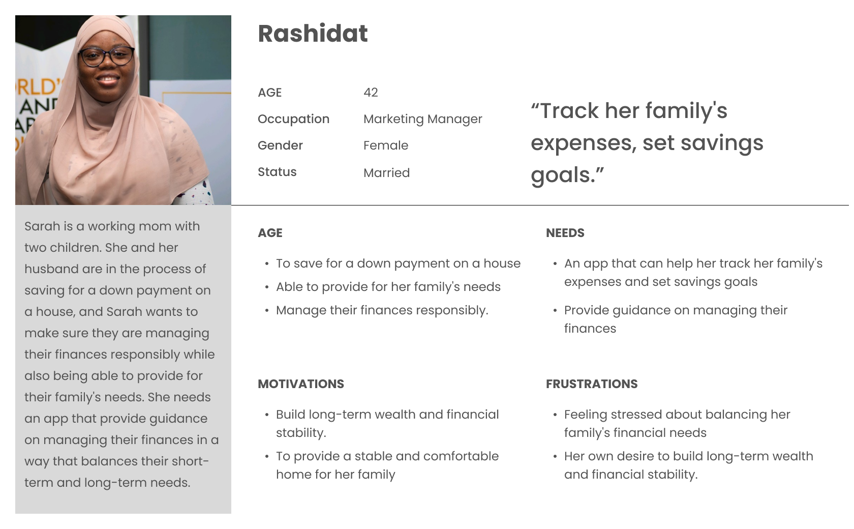
Since I have gathered a bunch of knowledge of the audience, as well as their goals and needs, I use the user persona to represent key audience segments. It helps me focus on tackling the most important problems – to address the major needs of the most important user groups. It is both fictional and realistic. Every time I made a design decision, I think about how would it satisfy the needs of the persona.
Let's meet Simon, a 27-year-old data analyst in Lagos. He has just started his career, and he wants to make sure he makes prudent decisions in terms of managing his personal finance.
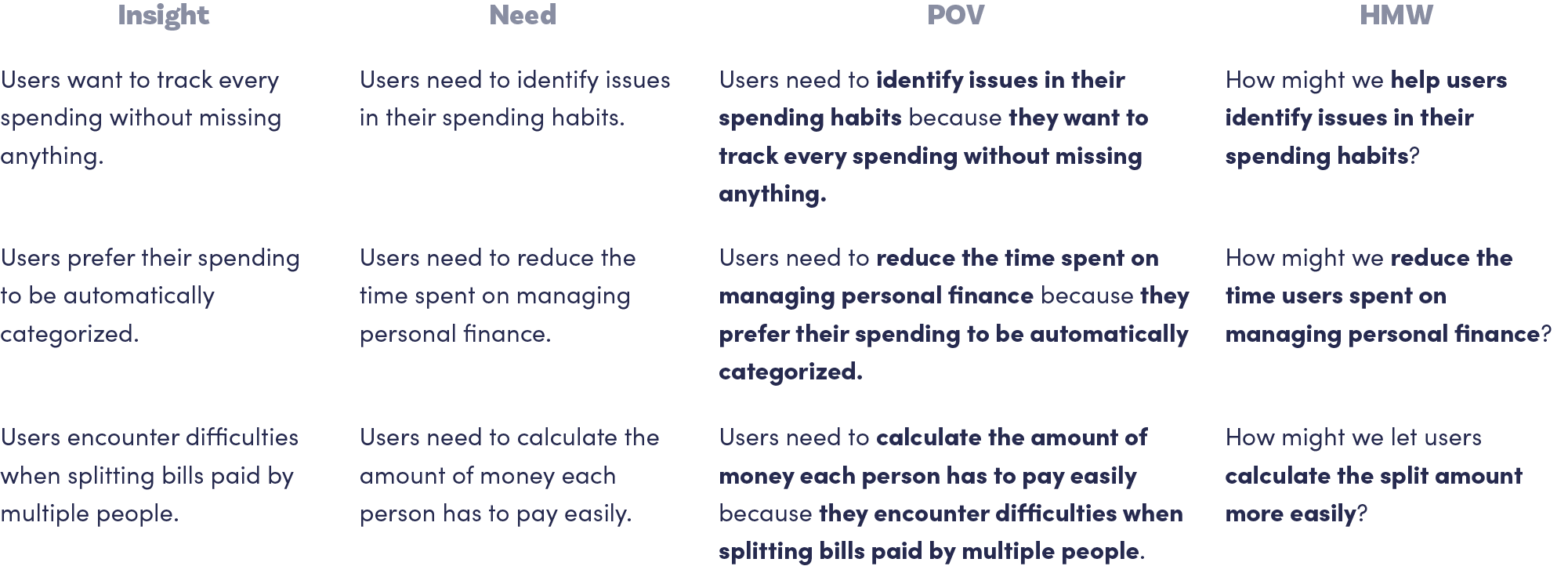
To define the problem I am going to solve, I create Point-of-View (POV) Statements that allow me to ideate in a goal-oriented manner, and How-Might-We (HMW) Questions to frame the ideation in the brainstorm session for solutions. The statements and questions are generated based on the insights and needs I gathered in my Empathy Map.
Centering on these questions, I then brainstormed solutions. I spent 3 minutes on each HMW question, and moved on to the next HMW question when the time is up. I then did a second round for each question, and finally arrived at my brainstorm results.
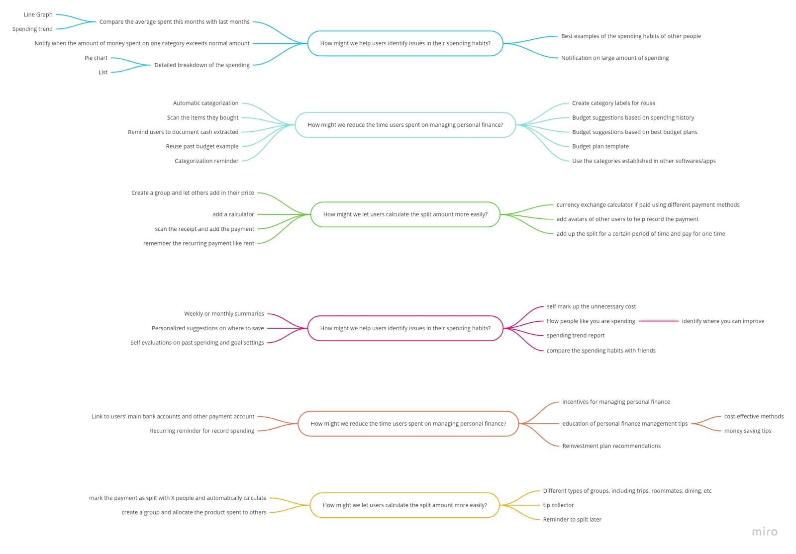
Apart from individual brainstorm, I facilitate a group brainstorm session with 3 participants. This activity helps me gather more solutions proposed from different minds of people. Before the group brainstorming, I sent out an agenda to each participant. For each question, the participants spent 3 minutes brainstorming and 2 minutes posting the sticky notes on Miro, an online collaborative tool. After two rounds of brainstorming, we spent 5 minutes discussing the brainstorming results.
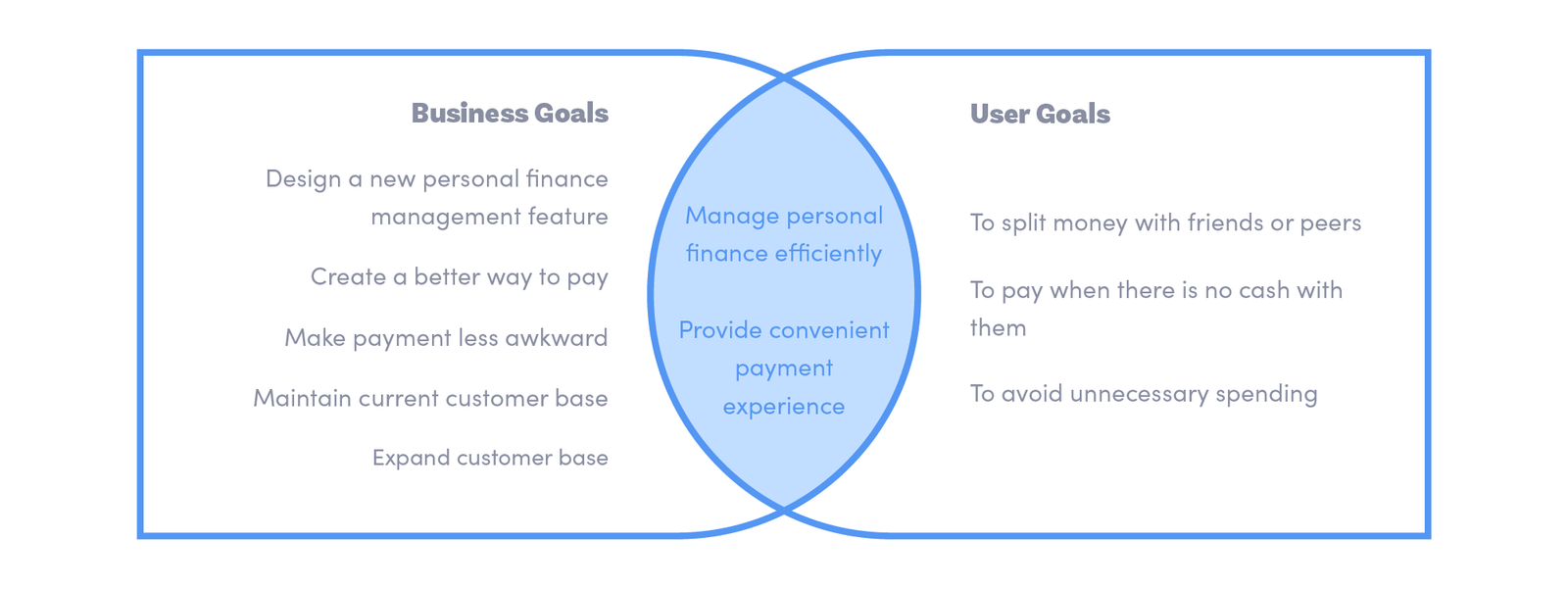
With HMW questions and brainstormed solutions, I decided to list project goals that will both serve as a guide for the future development of the product and a rubrics for determining what features to include in the website.
I established business goals by referring to published coverages of Budget Bounce business, and summarized user goals from my user persona and empathy map. To make sure the product we are developing is both usable and sustainable, I identified mutual goals by aligning specific business goals and user goals.
I then started to put the solutions I brainstormed into a list of product features to create a comprehensive product roadmap. These features were sorted into four categories, including Must-have (P1), Nice-to-Have (P2), Surprising and Delightful (P3), and Can-come-later (P4) features. They were sorted based on how well they can help achieve business goals and user goals.
Product Roadmap not only infuses the project goals into our product, but also ensures we prioritize the most important features in the development cycle.
.png)
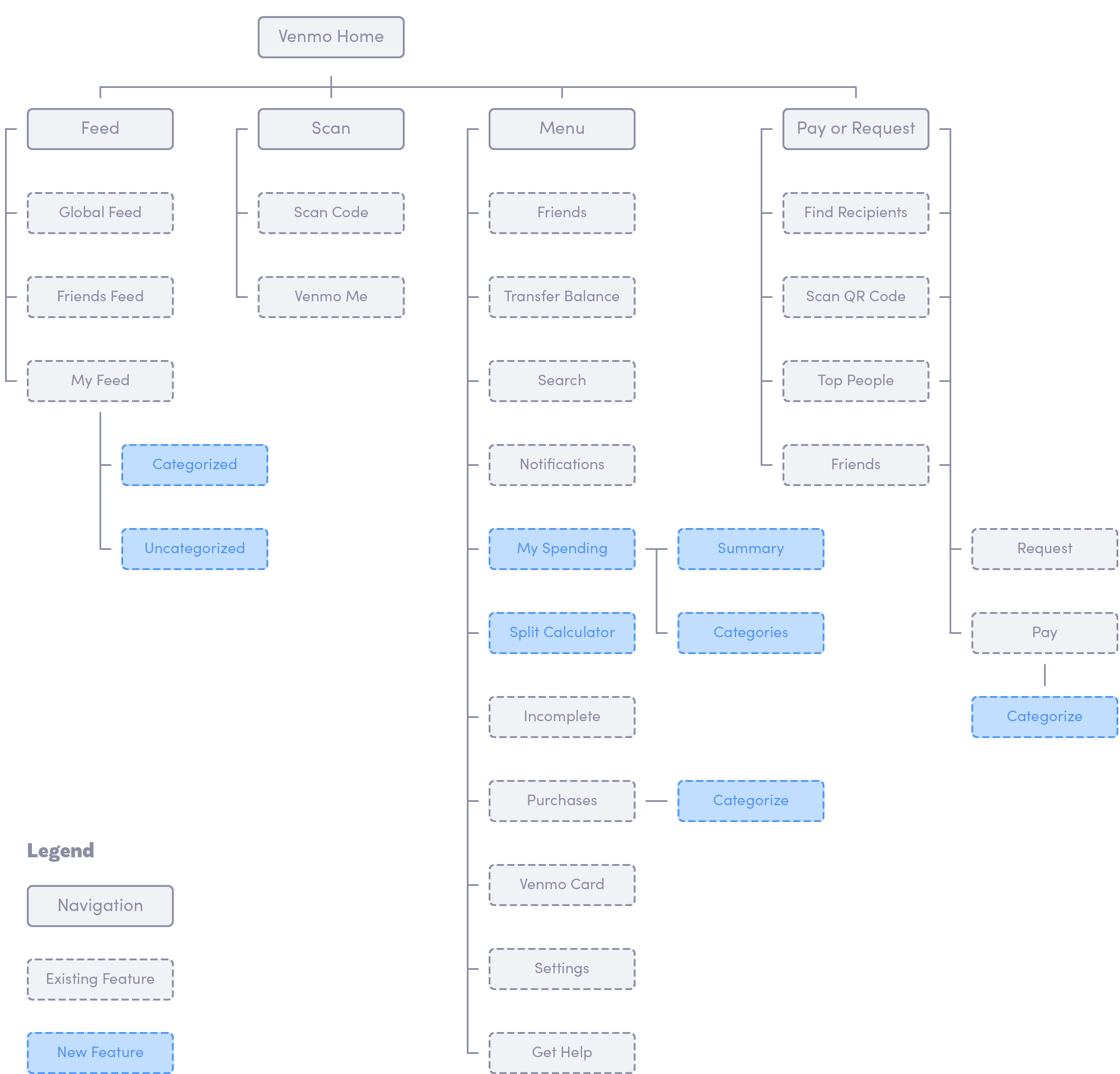
After setting up the product goals and deciding what features to include, I want to continue building up the structure of the app using the application map. An Application map helps me to visualize the relationship between the content and examine the hierarchy.
I first mapped the existing application map of Budget Bounce, and identified sections where I can add the new features.
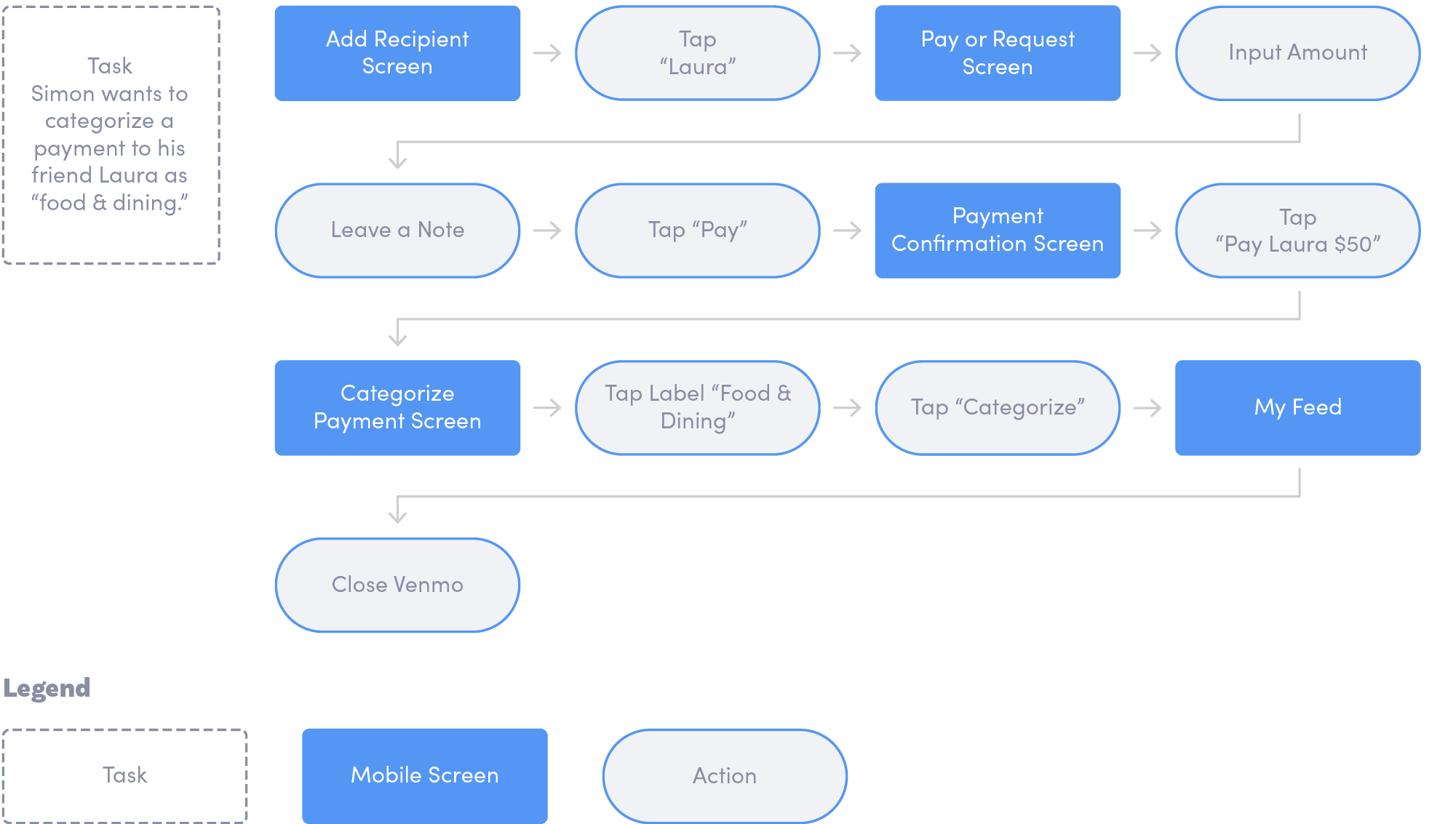
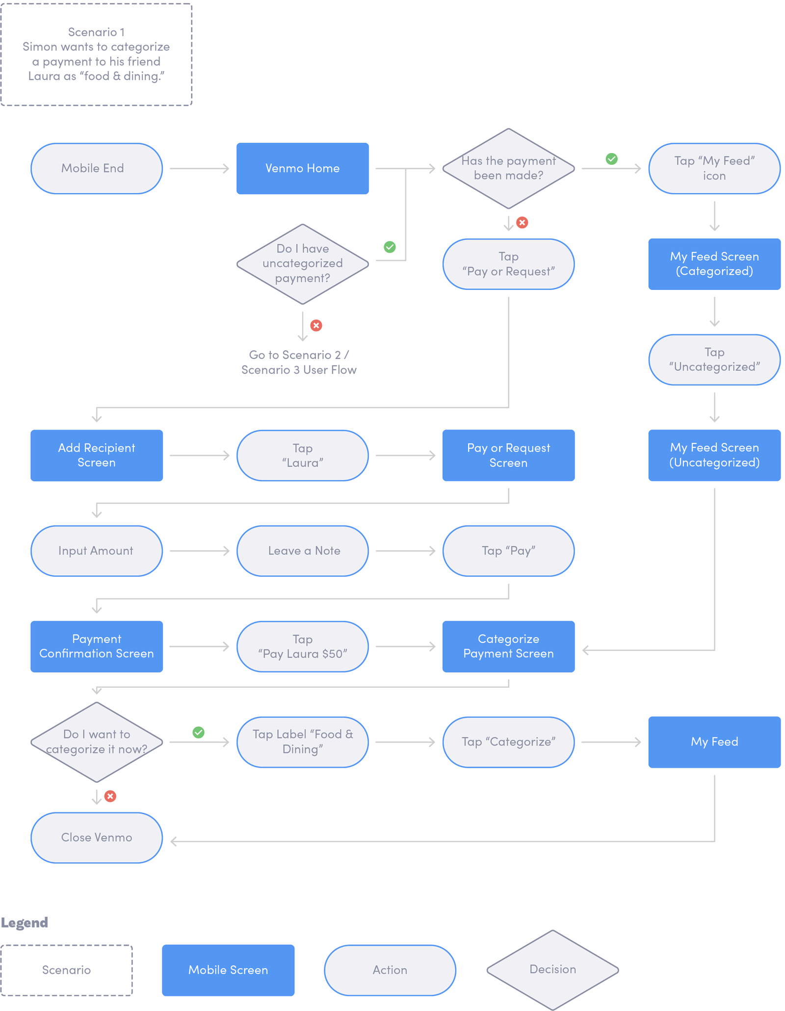
To decide what I am designing, identifying the main flow of users when completing a task helps me to direct my focus on designing specific pages. By creating task flows that center on the new features I am adding for Budget Bounce, I was able to think through the necessary steps and examine the user experience in details. Below is the flow for 1 task, and a complete diagram of task flow can be viewed here.
Building on the task flow, I mapped user flows whose scenarios correspond to the established tasks. The decision trees were added for me to think through what actions users would take based on their feelings with the website. Below is one example user flow, and a complete user flow could be viewed here.
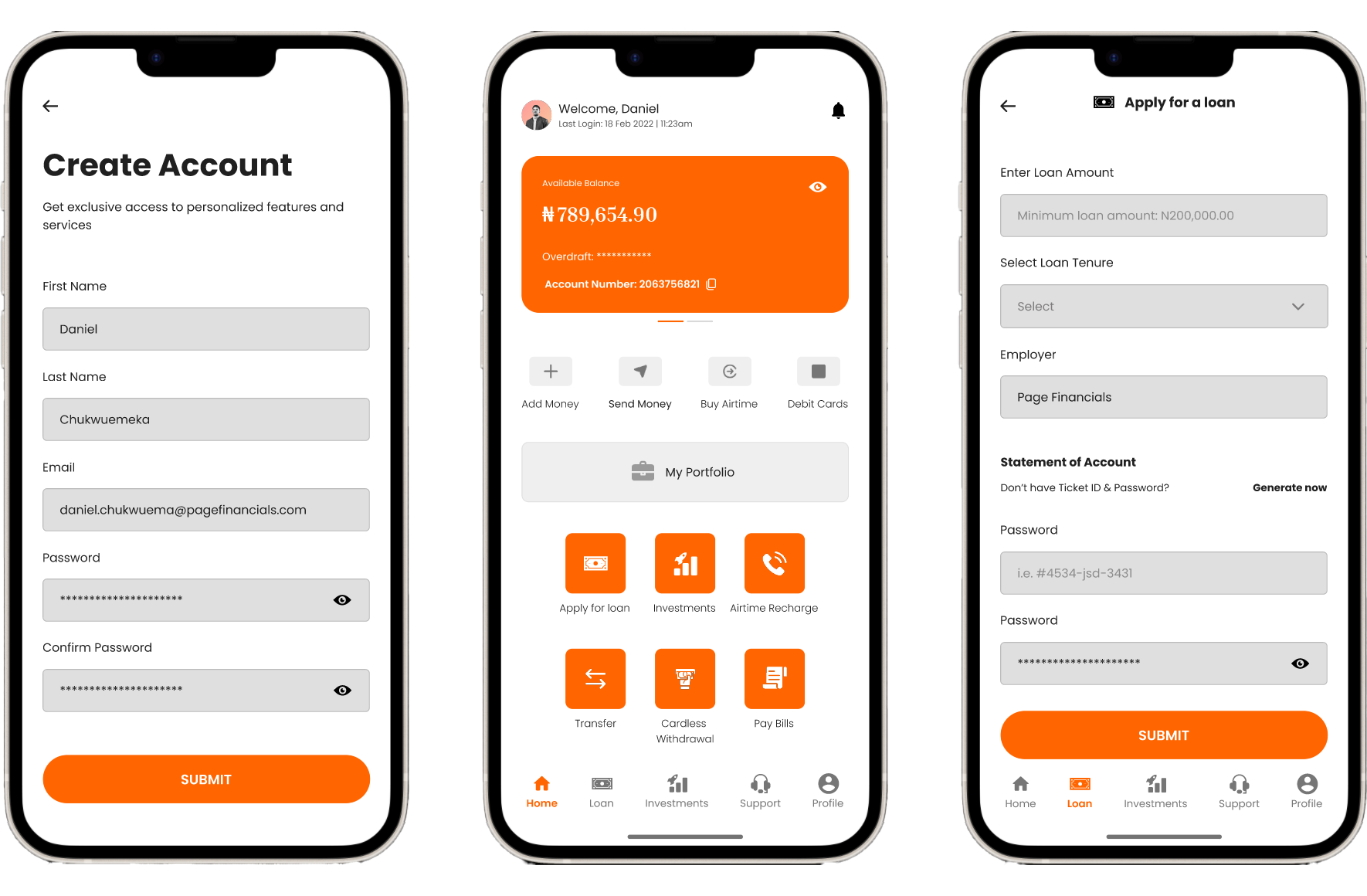
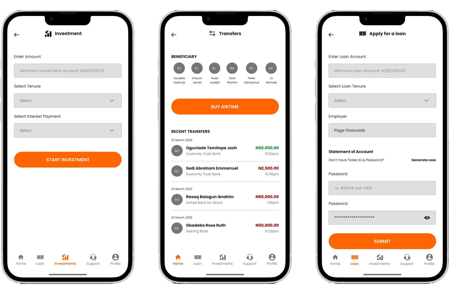
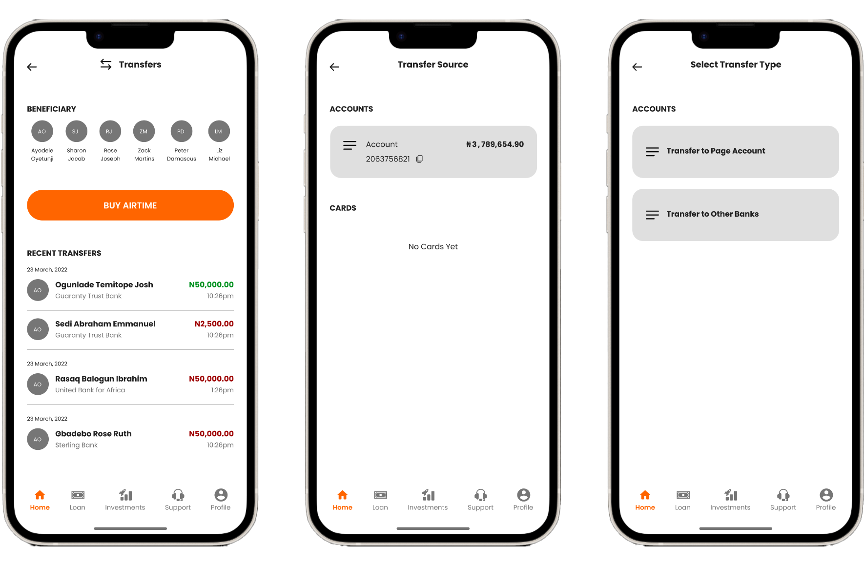
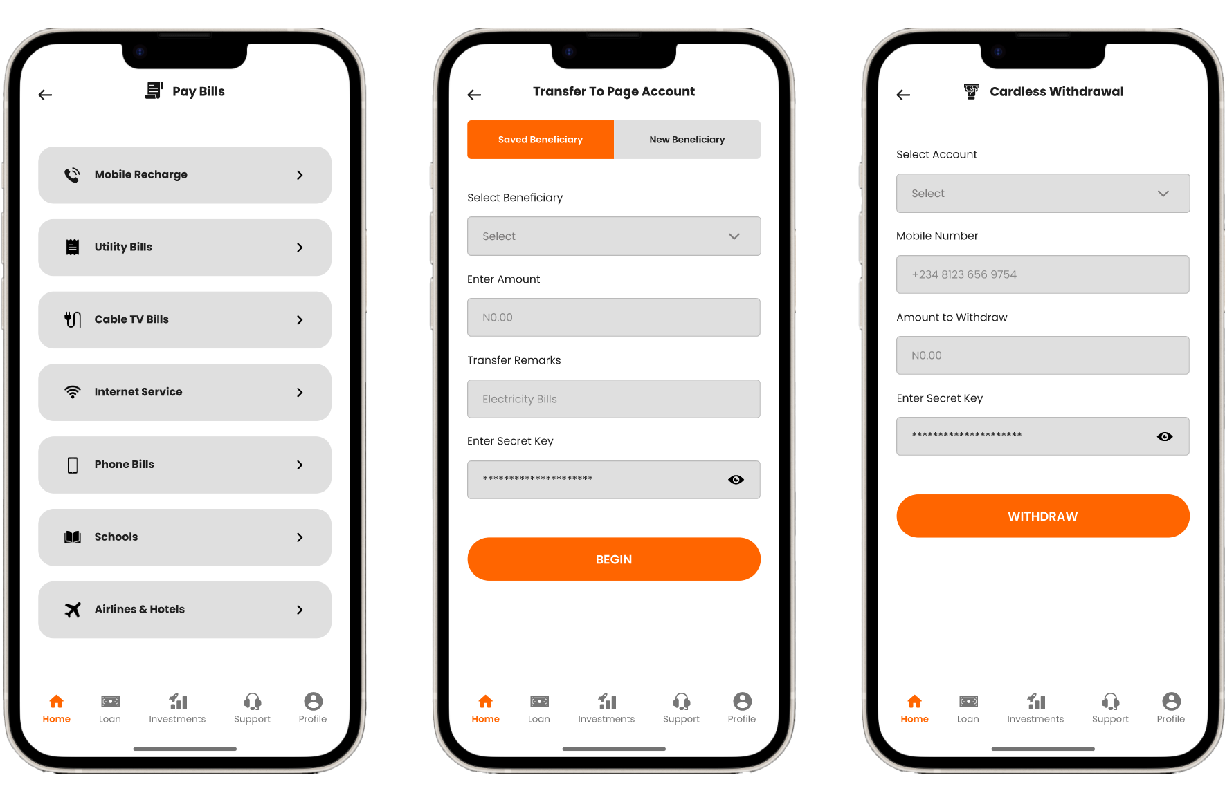
After creating an UI Requirement Document with a to-do list for designing the key screens identified in the task flow and user flow, I started sketching low-fidelity screens. I can capture my ideas by pen and paper quickly by sketching. It also enables me to examine my ideas before putting everything in the daunting process of digitizing.

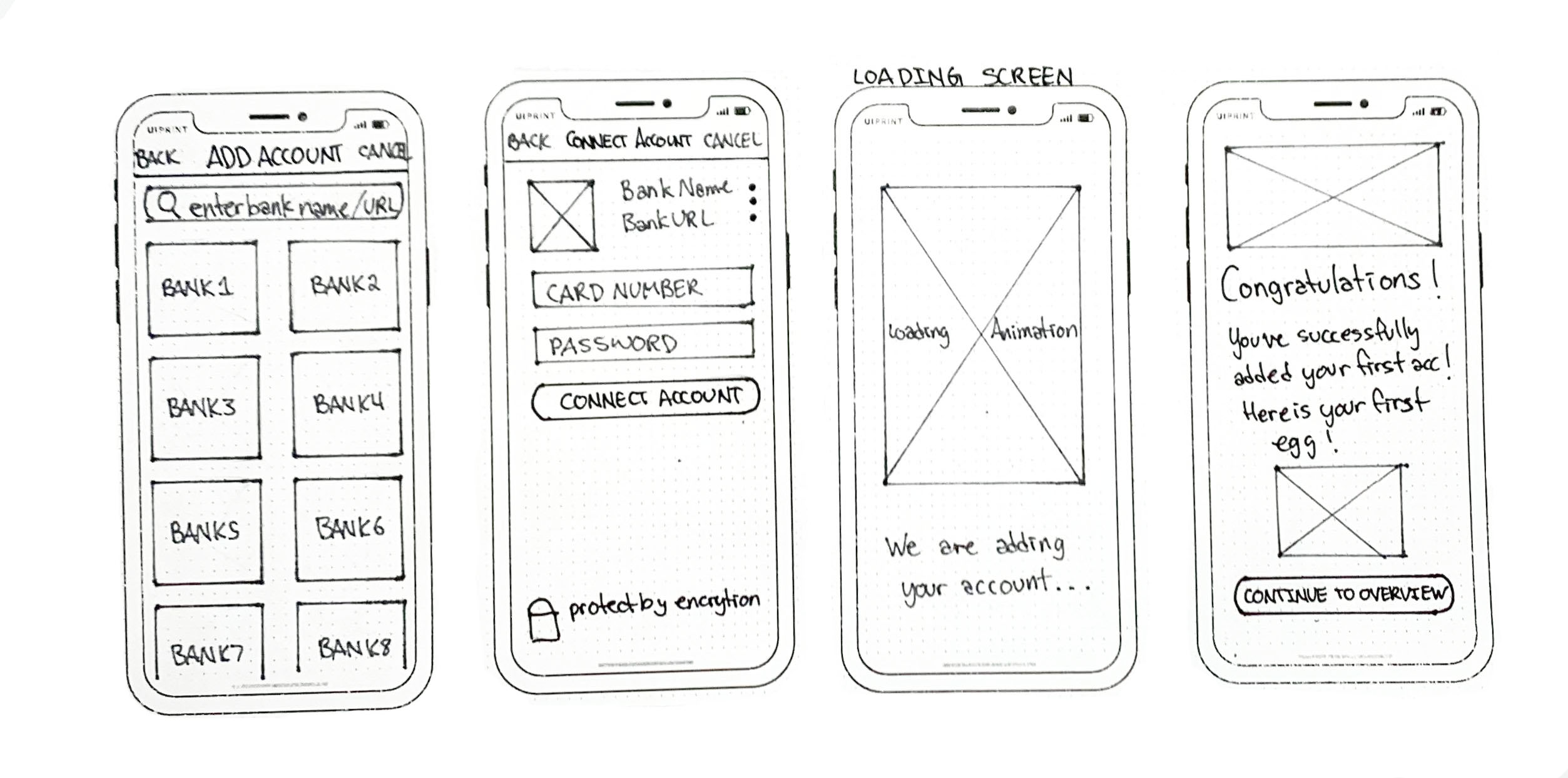
Once I decided the visual direction of the layout I want to go for, I started to produce a digitized, low-fi version of wireframes based on sketches. It allows me to apply product UI requirements, ensure elements are placed with the guidance of correct hierarchy, and avoid spending too much time on designing details.
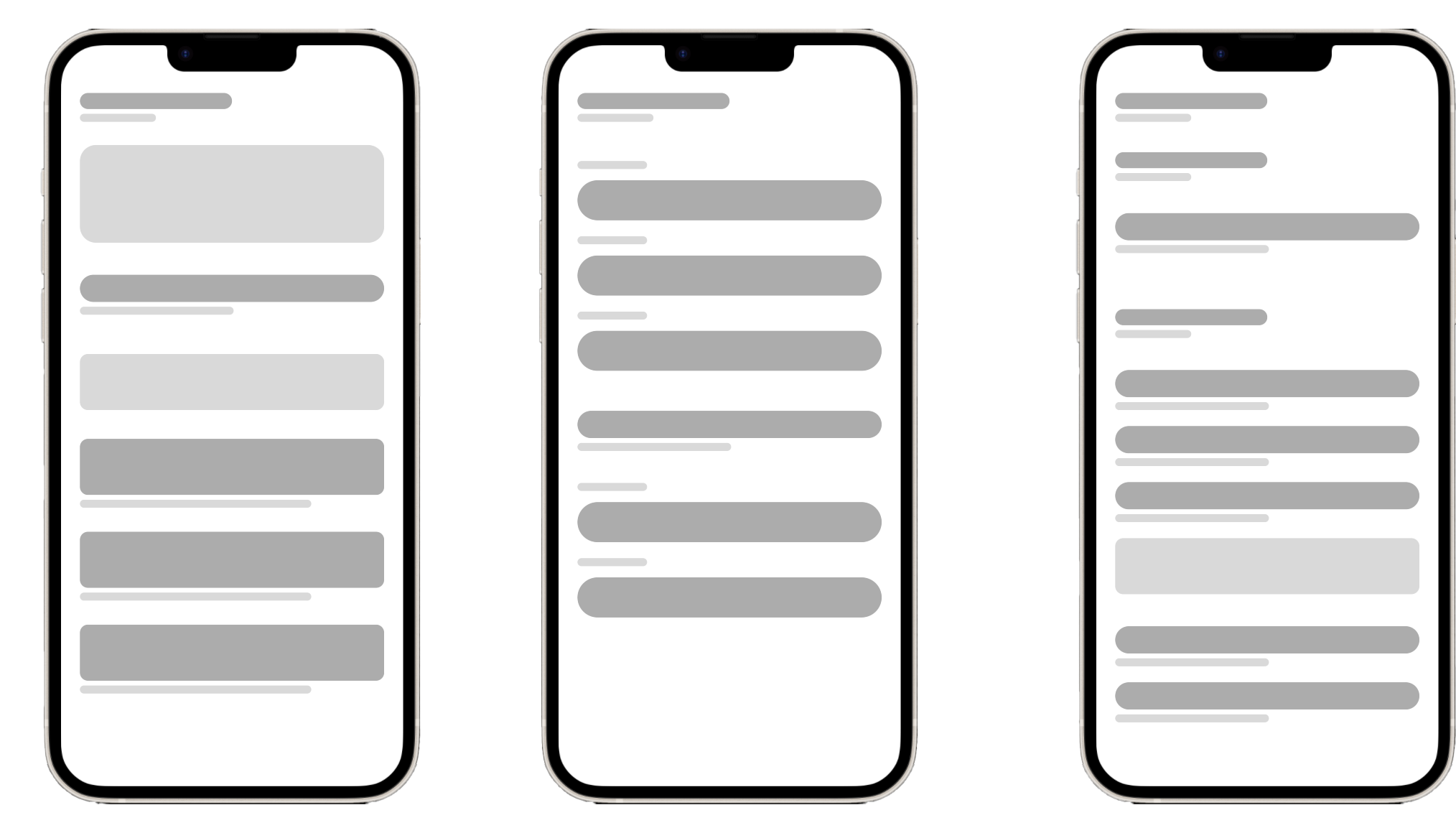
Furthermore, to ensure users have a consistent experience across different devices, responsive wireframes are created for desktop, tablet, and mobile ends.
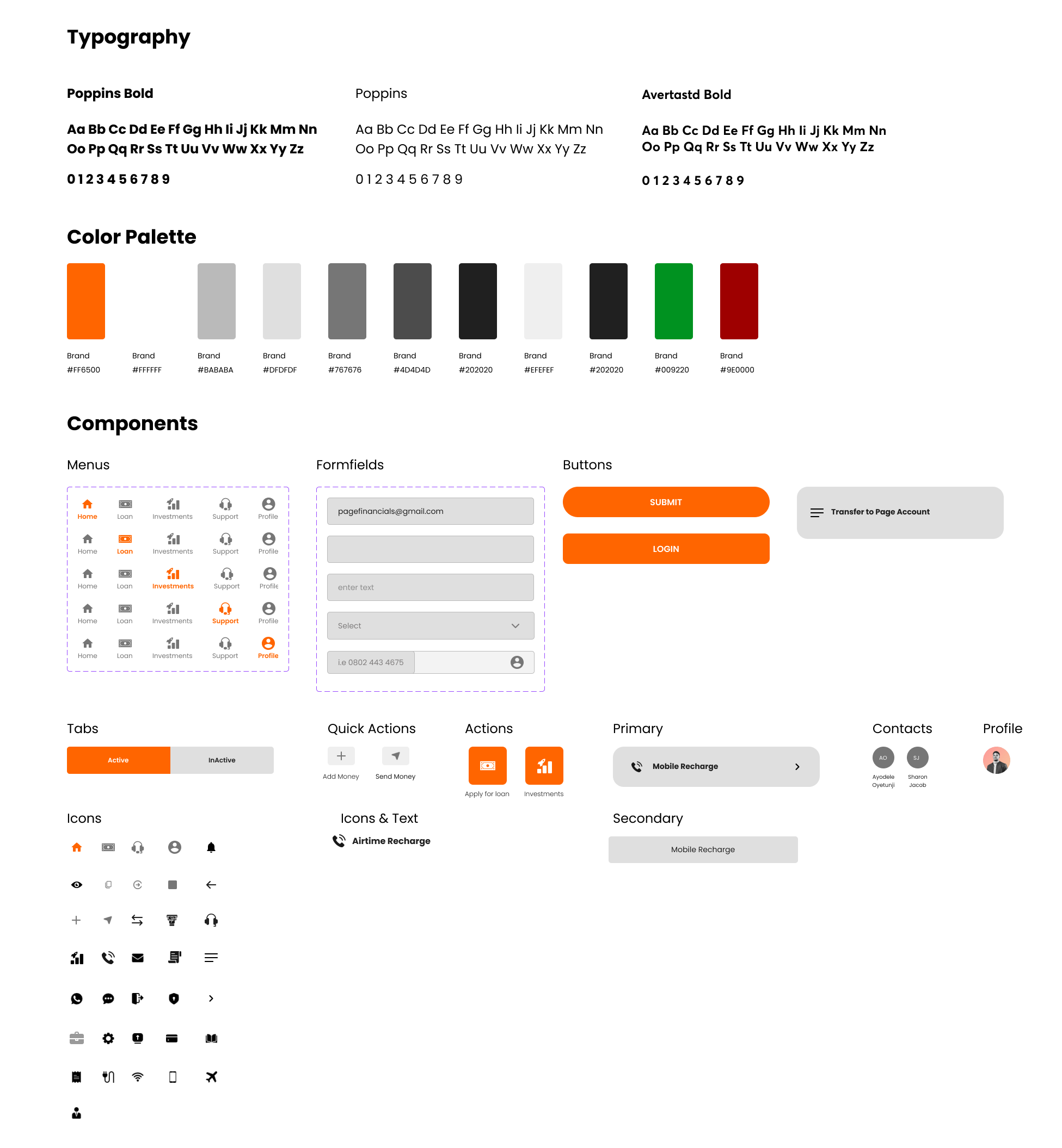
UI Kit is a compilation of existing UI elements on the website that provides references for future design and collaboration for the design team. It is also a living document and will be updated whenever there is an iteration of the design.
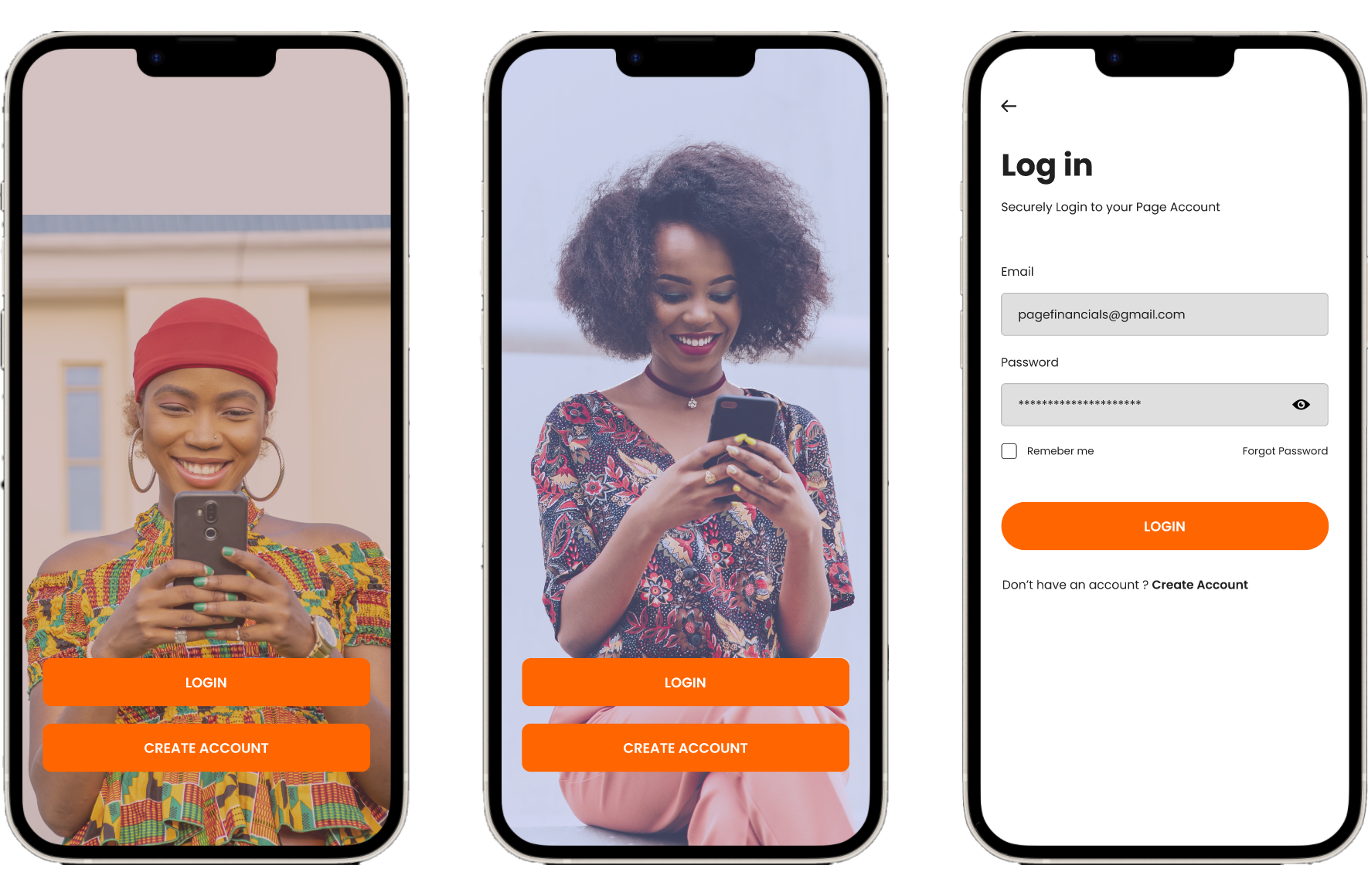
In the Prototype phase, I build scaled-down versions of the product for testing. It helps me uncover false assumptions, identify UX frictions, eliminate errors before investing too much in developing the product.
Before usability testing, it is important to set up test objectives, subject, methodology, tasks, and rubrics for measuring the result of the testing before conducting a test. Therefore, I wrote a usability testing plan to define what and why I want to test and get prepared for the test.
I expect a 100% completion rate since all tasks are normal steps for managing finance and were designed using existing patterns of Venmo. I also expect a 90% error-free rate because the prototype is not fully functioning, and users might take alternatives that have not been built up for completing the tasks.
I then conducted both in-person and remote usability testing with 5 participants, and created transcripts for each participant based on my observation of their interaction with the prototype. I jot down their mistakes, slips, and confusions they expressed in the process. This transcript is a perfect raw material for summarizing the patterns of user’s interaction with the prototype.
The results from the usability testing could be summarized by creating an affinity map. Like the empathy map, it is effective in helping us find patterns and frustrations when users are interacting with the prototype, and identify areas of improvements based on priority levels.
I represent each participant using a unique color, and categorize the observation by success, patterns, and frustrations. I only listed patterns that are shared by a majority of participants. For each pattern from frustrations, I uncovered one insight, and generate one recommendation. I then ranked the recommendation based on the priority level, where I will fix problems that affect key functions for our website and customers’ quick recognition of the brand.
