Simplebook
Simplebook is a B2B SaaS web application that offers an all-in-one project management tool to help improve productivity for business owners. We were tasked with creating the MVP of the web application.
Business owners subscribe to numerous applications to manage operations which can easily get difficult to keep track of.
Simplebook seeks to be a system that integrates workflows such as invoicing, proposal creation, and contract management, for more efficiency.
To design a user-centric interface for Simplebook that integrates key business workflows, including invoicing, proposal creation, and contract management, into a unified platform. The goal is to improve efficiency, reduce operational complexity, and provide business owners with a seamless and intuitive experience.
Figma, Figjam, Miro, Airtable, Zoom, and Google Suite
Co-lead UX/UI designer in a team of 5
8 weeks
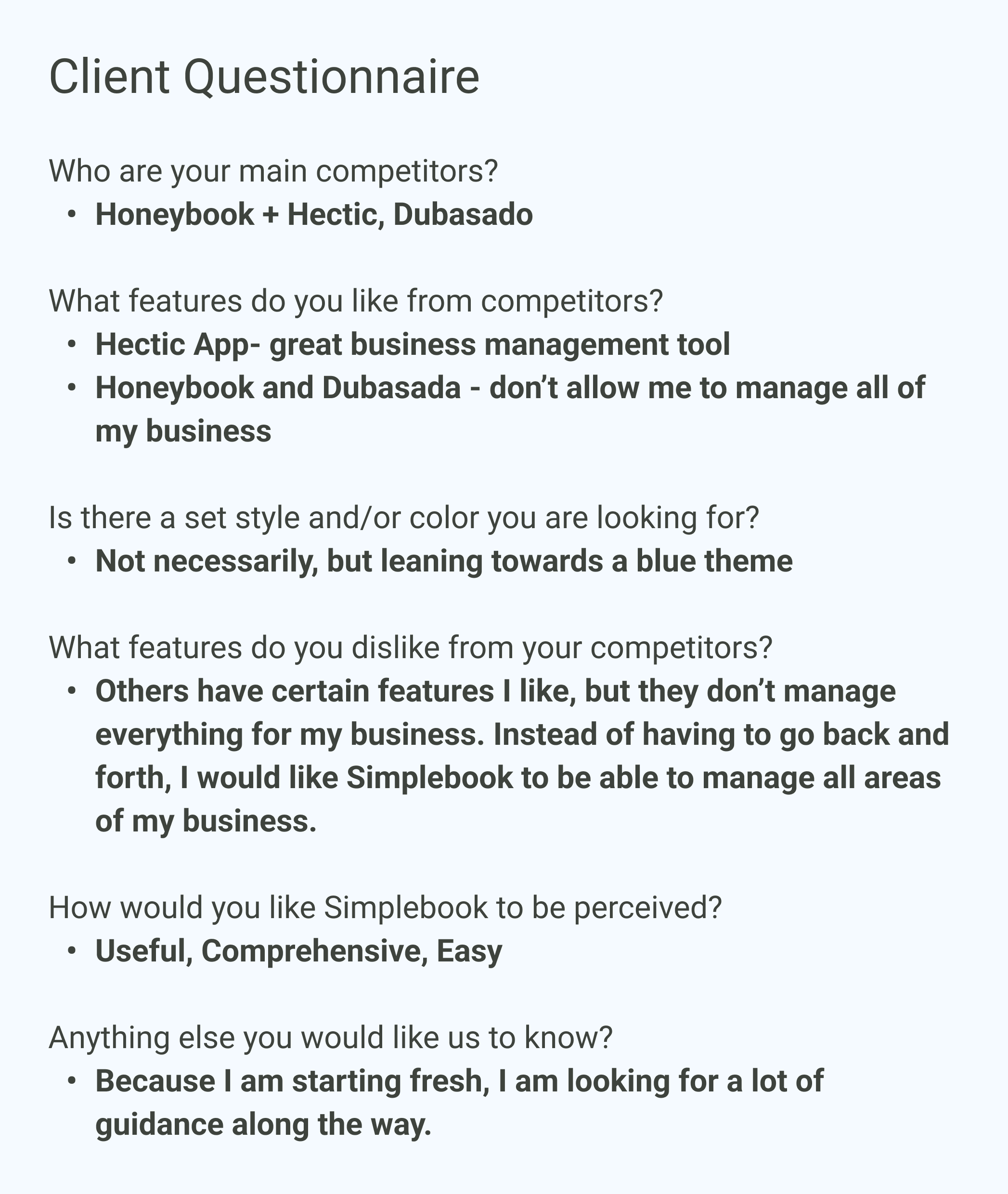
To gain a better understanding of the client's vision, a questionnaire was conducted.
The questionnaire clarified these important points:
Through talking with the client, I could see that we were being tasked to create the MVP for this product concept.
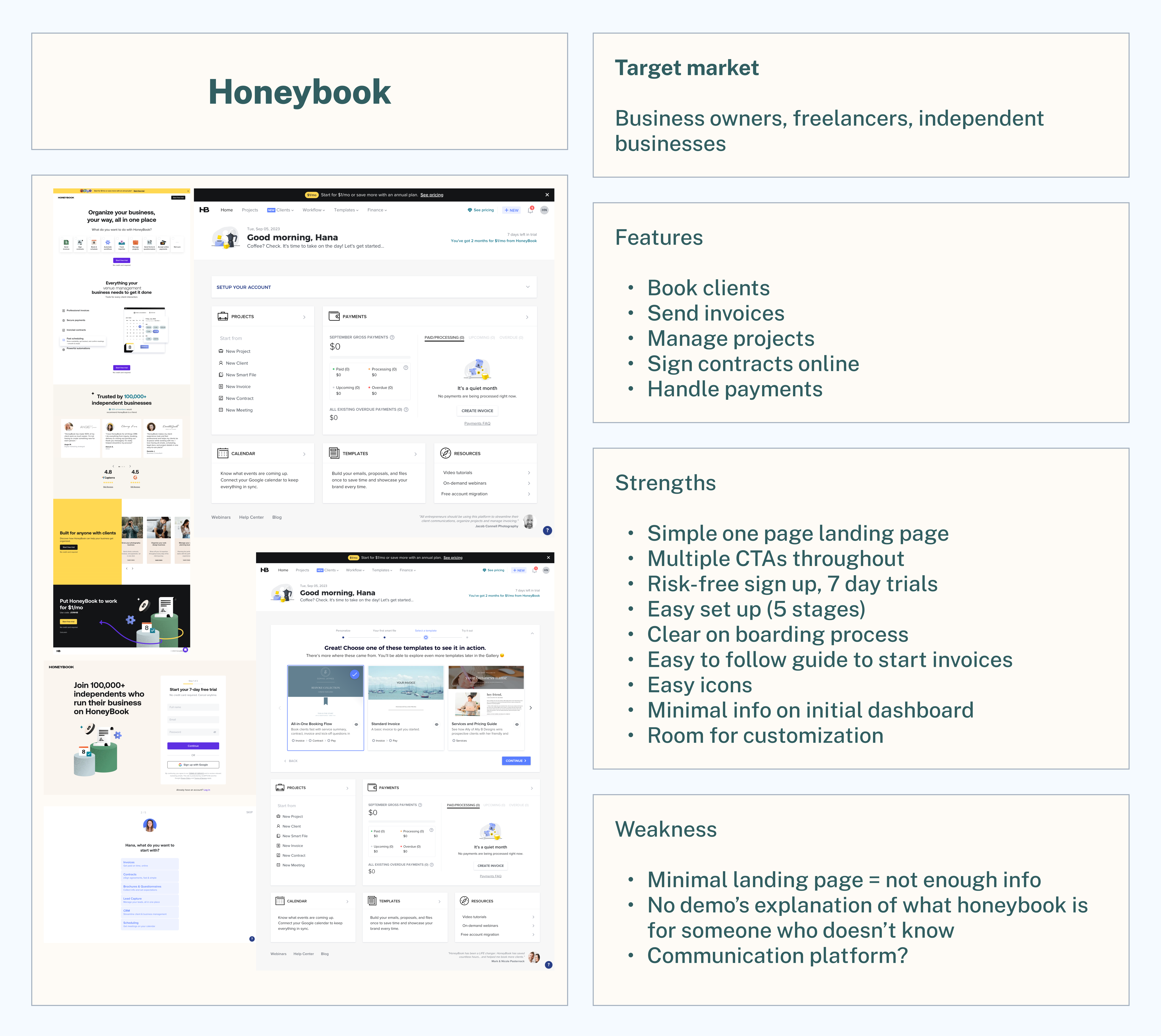
I examined the list of the client's competitors and collected data that might help us in our process.
Here are some of our main observations:

I felt that I could better assist my team if I did a deeper dive into the user customer. I did a quick empathy map in Miro to help me get into the mindset of a brand-new business owner to think about how I might use Simplebook.
The user stories were provided by the client.
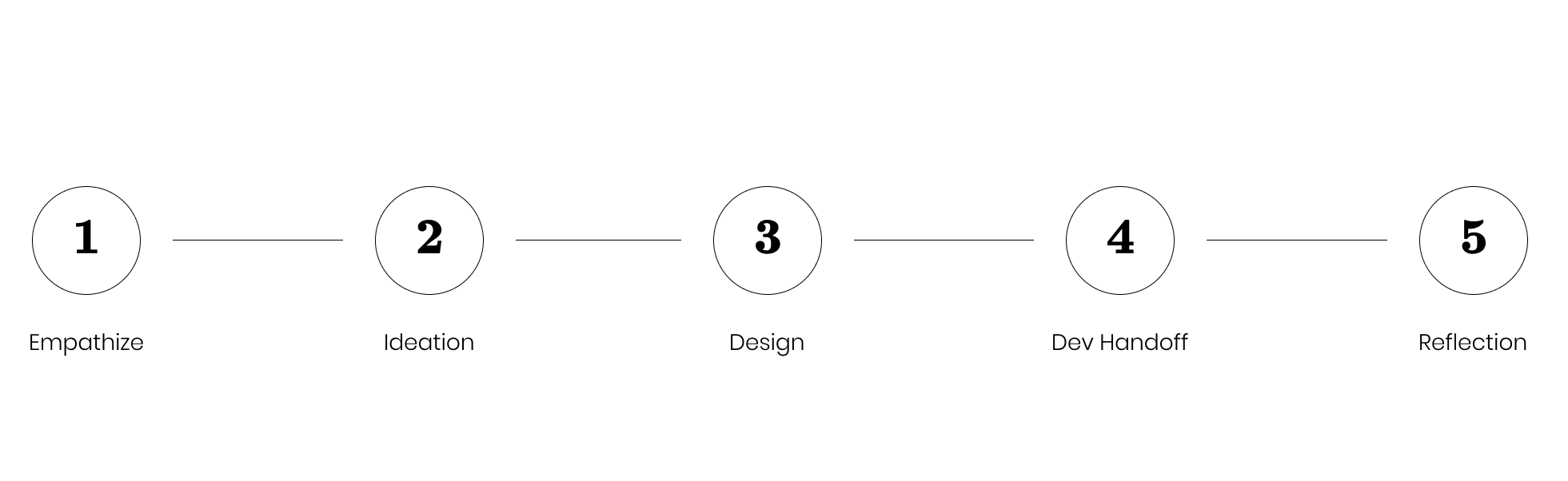
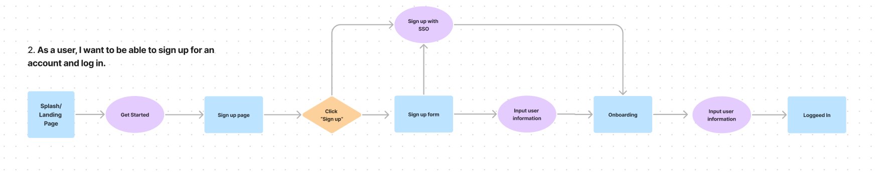
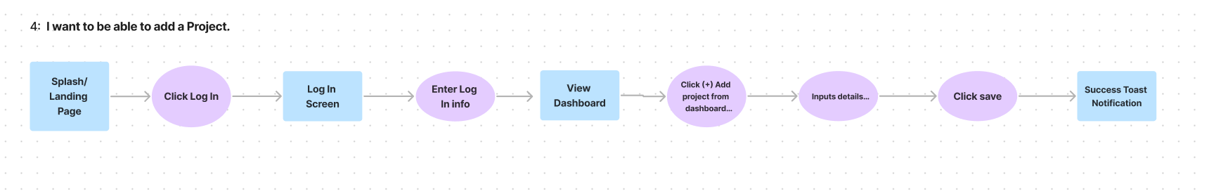
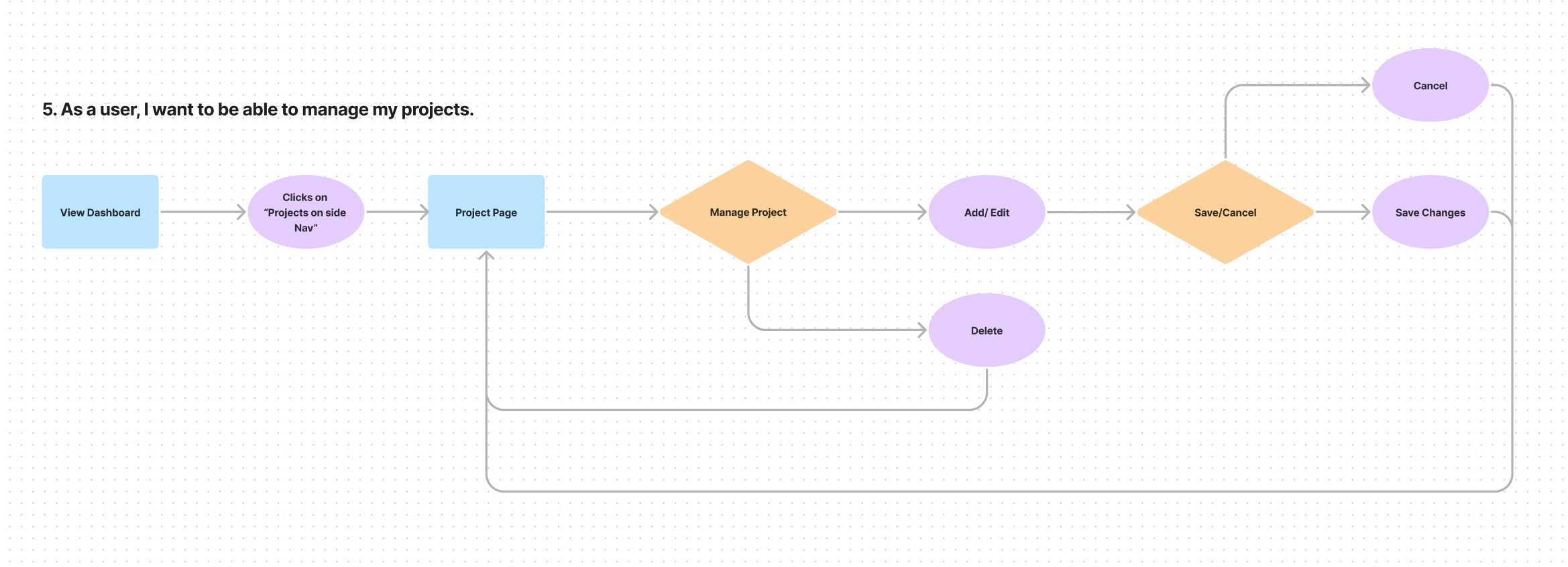
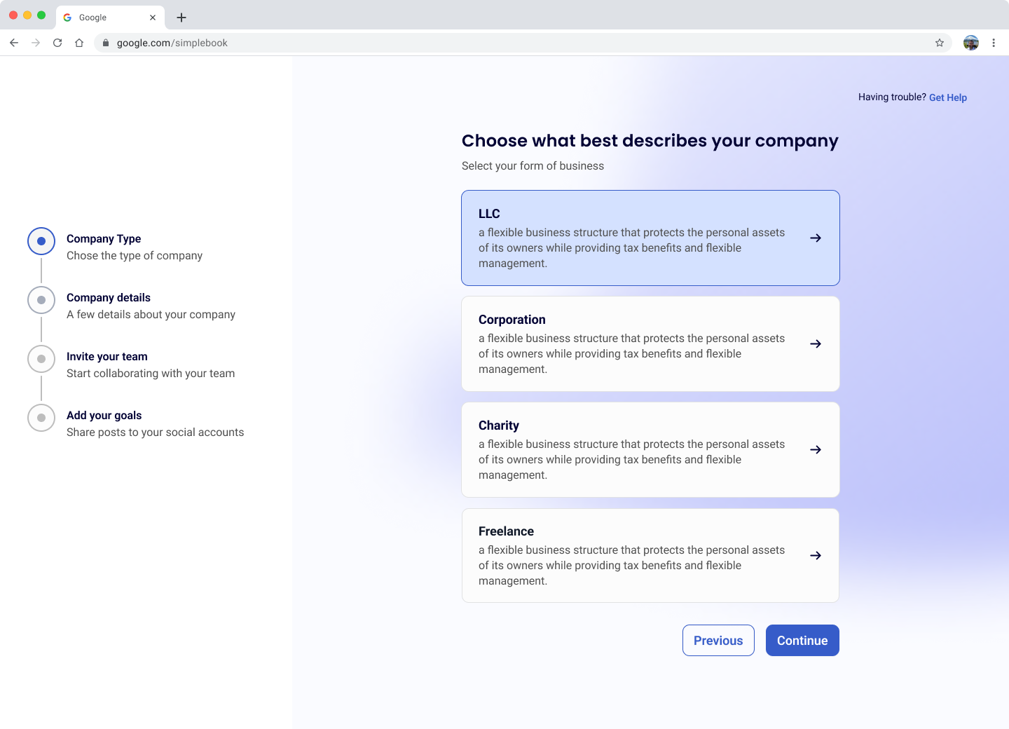
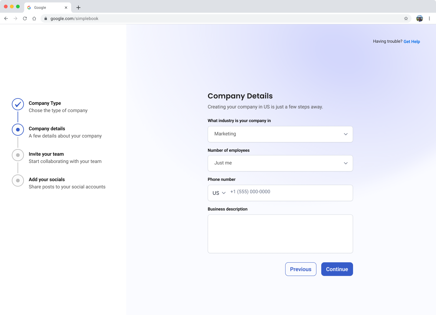
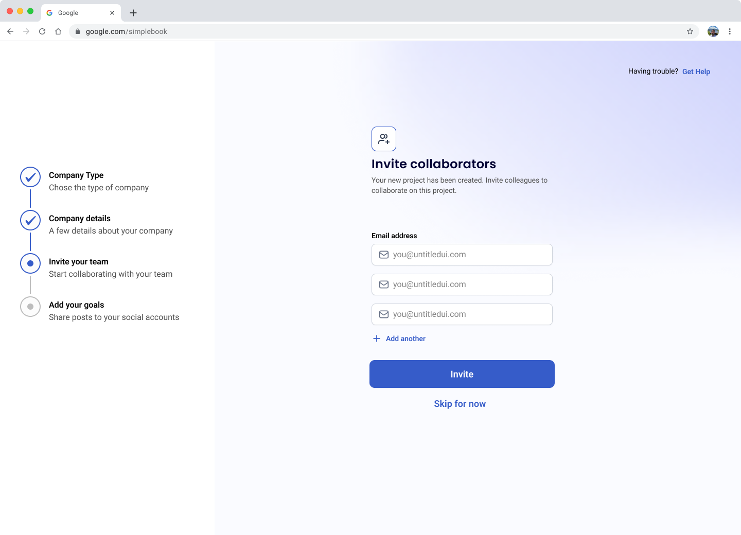
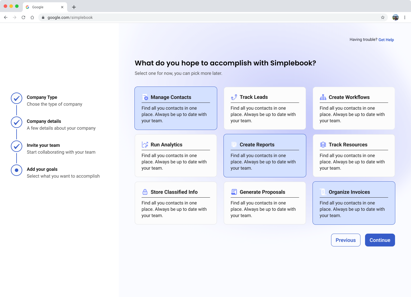
To design user-centric products, we needed user flows that allowed us to understand what our users needed in order to accomplish their goals. I was a part of creating user flows 1 and 5. Managing a dashboard can be overwhelming, so our goal was to keep our flows as simple as possible to minimize any pain points.


To effectively tackle the design workload, we allocated specific user flows to each designer for creating mid-fidelity wireframes. Our aim was to ensure that our screens adhered to best practices for dashboard design.
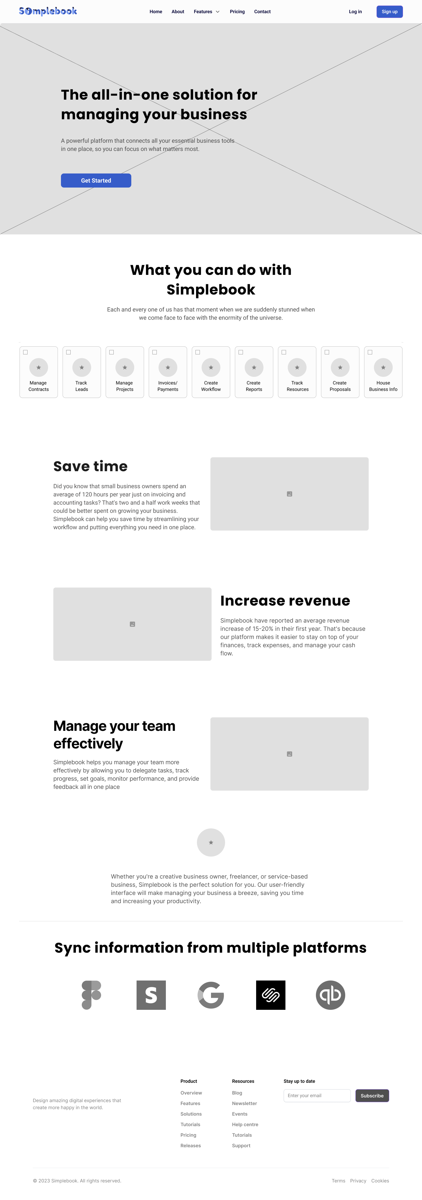
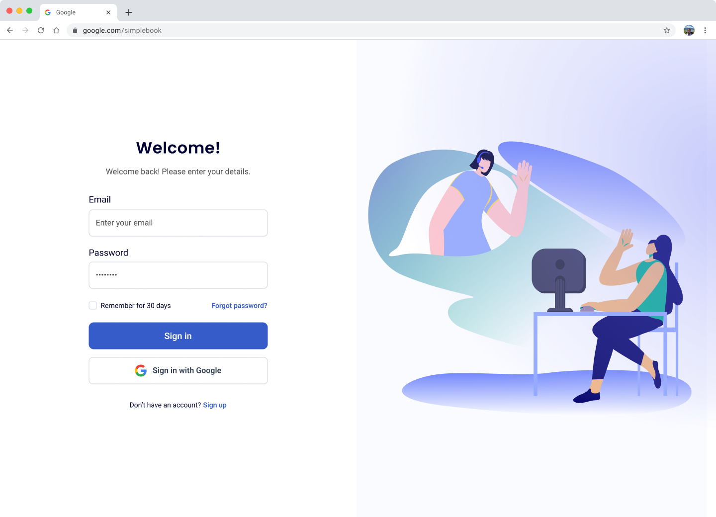
While we collaborated as a team for a cohesive look, I took charge of the landing page. The landing page needed to be simple yet effective in converting to sales. Potential clients would easily be able to see the value of using Simplebook just by viewing this page.


Because we are tasked with the initial MVP, we decided to moodboard some ideas in terms of brand identity.
Some findings were:

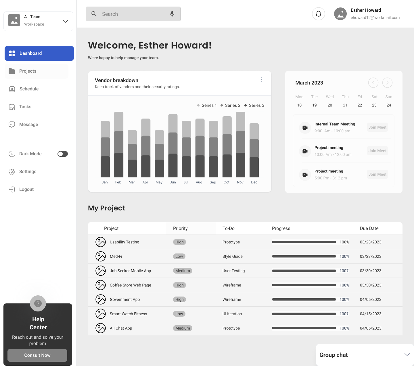
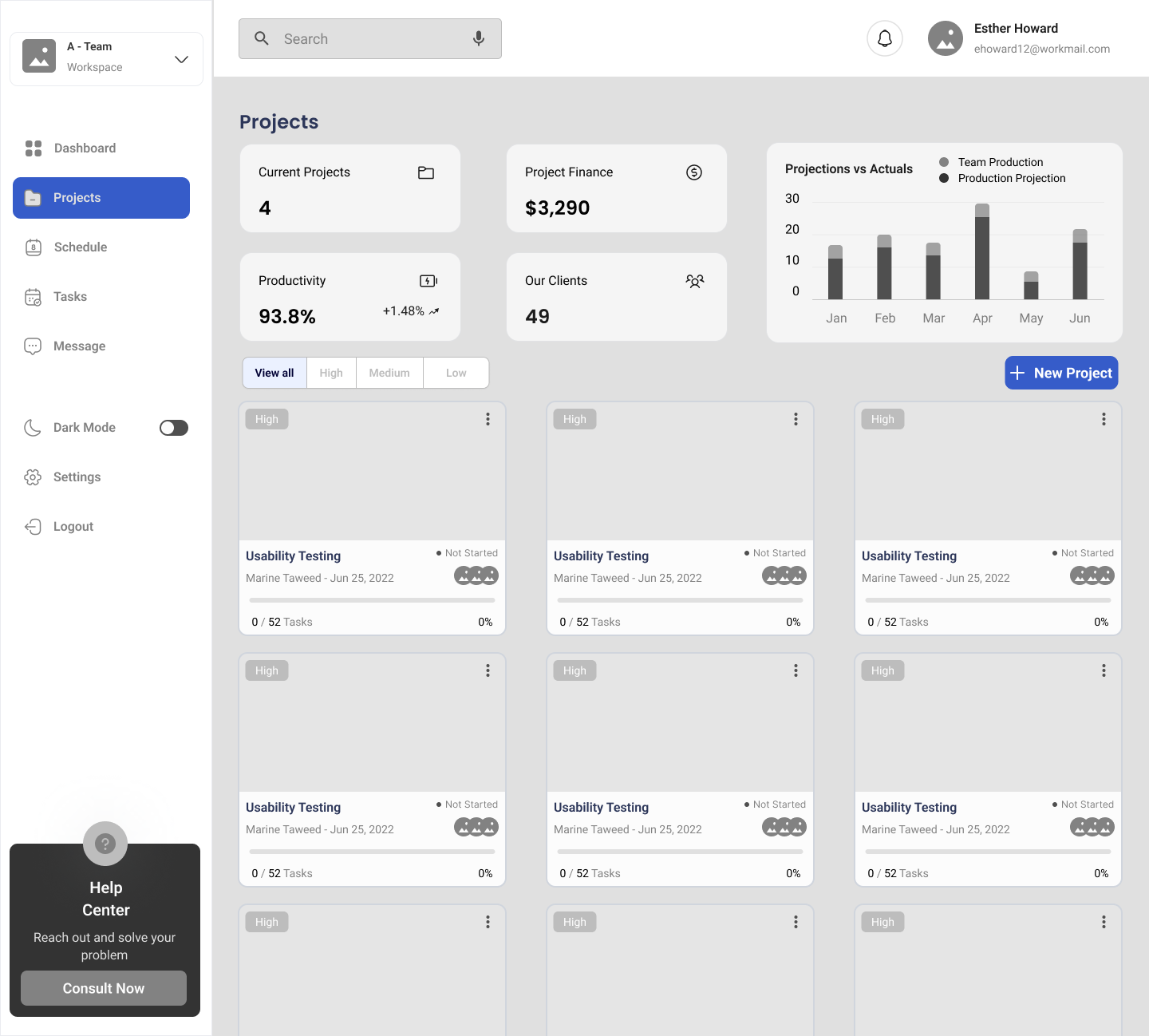
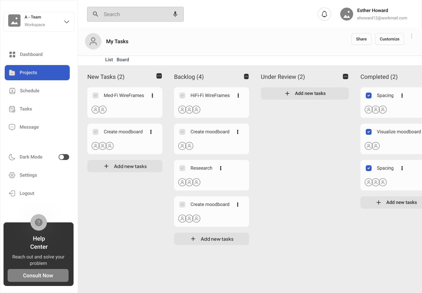
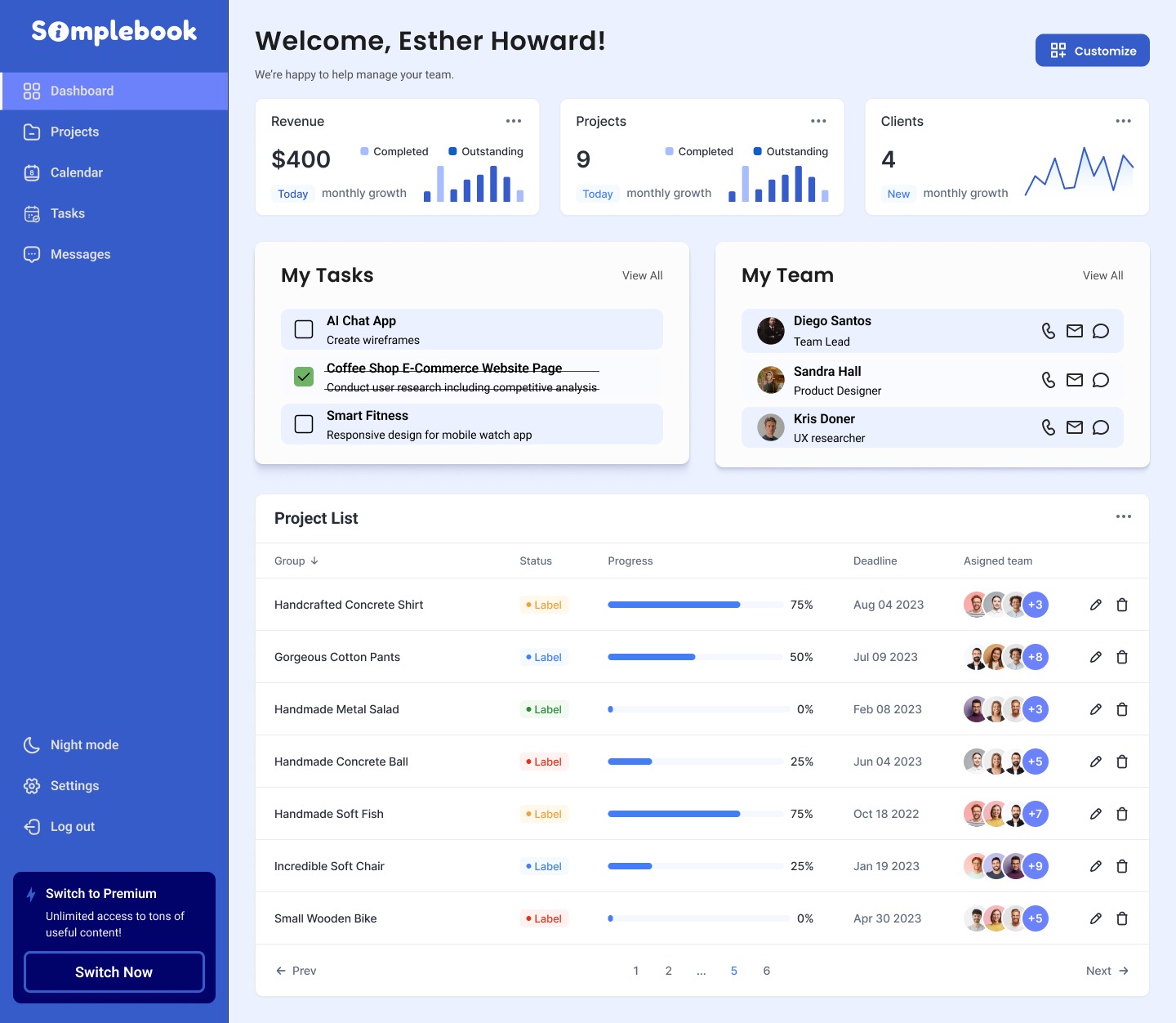
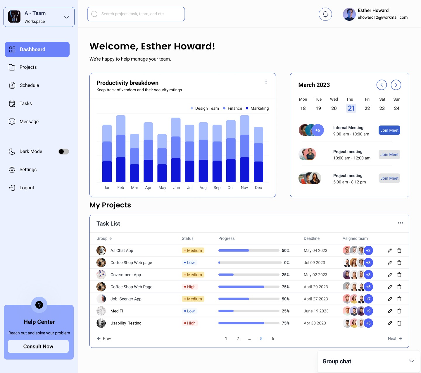
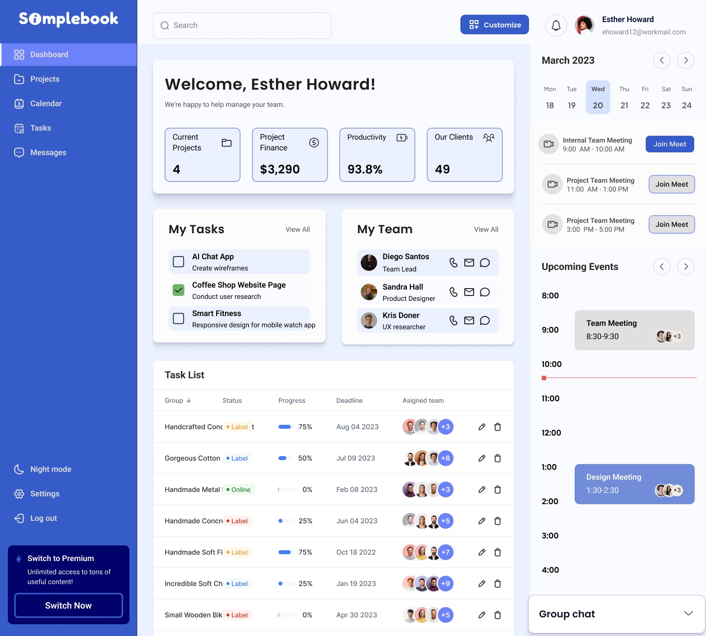
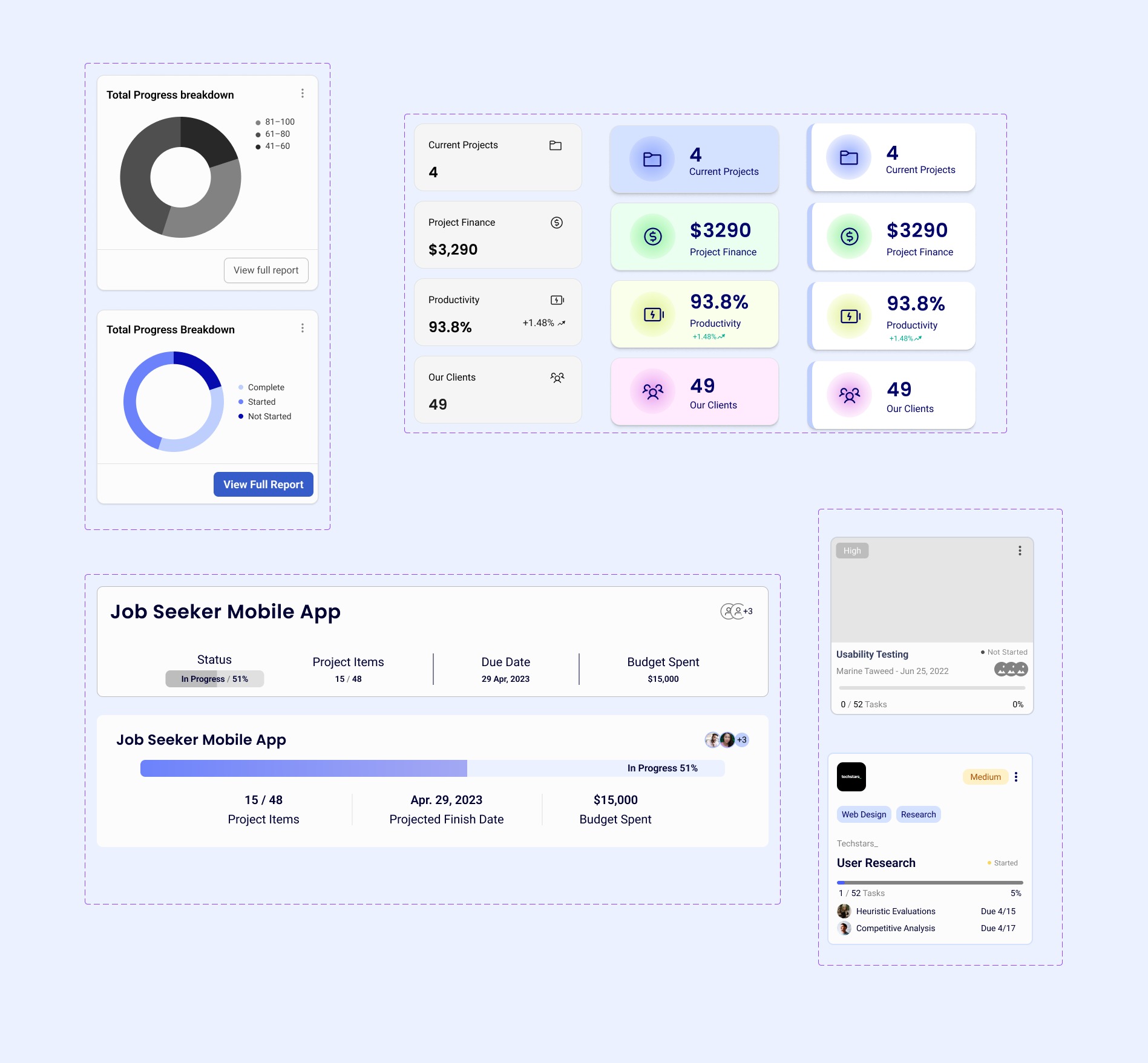
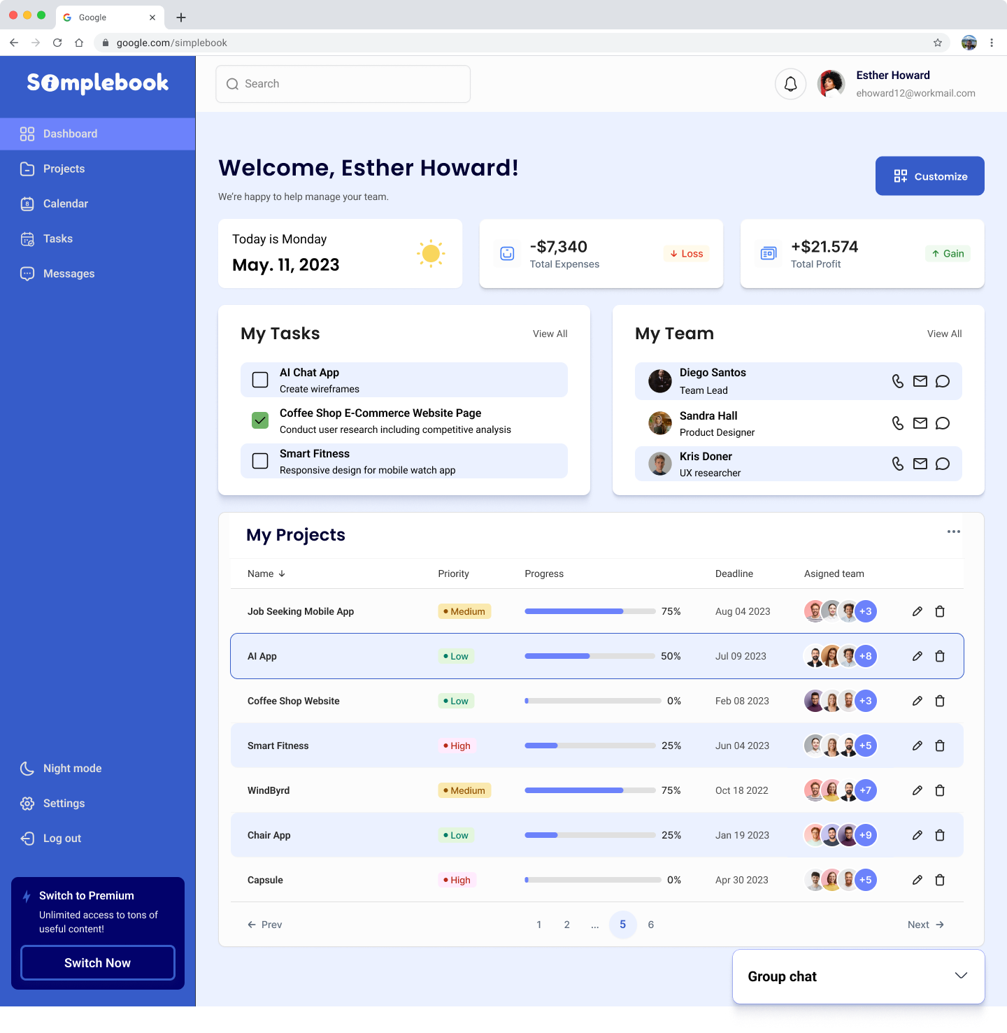
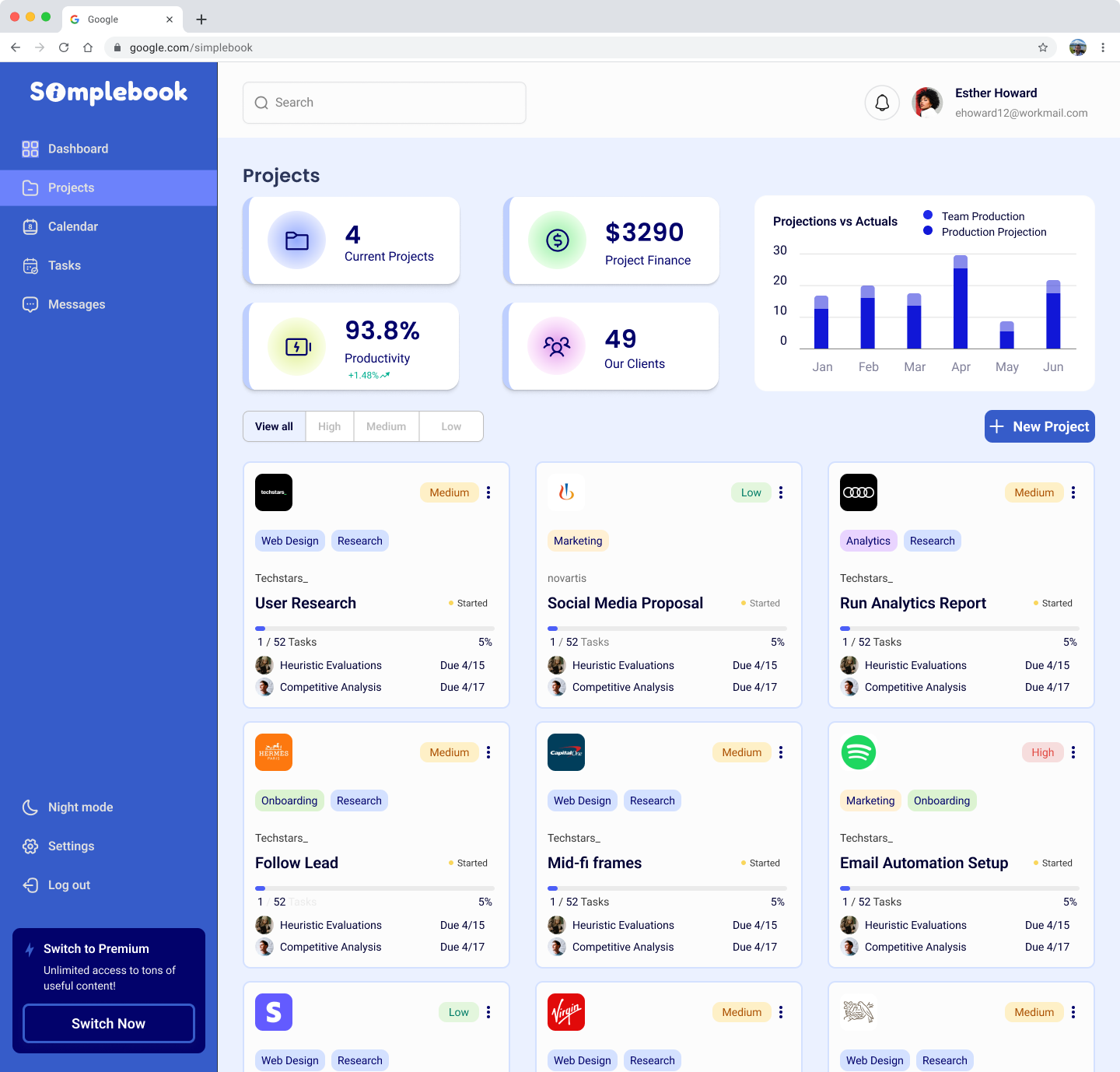
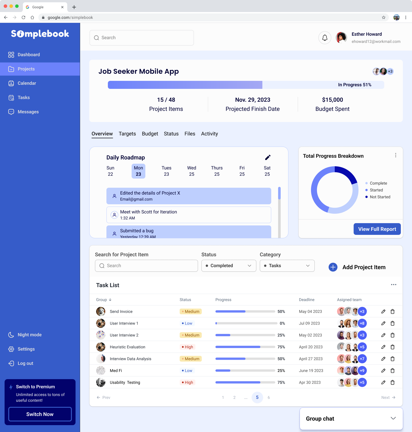
Our main focus was to create a clean and simple dashboard that felt easy for users to jump right into.
Some Key Takeaways:
I also shared some articles about how to create effective dashboards to help us understand the user experience better.
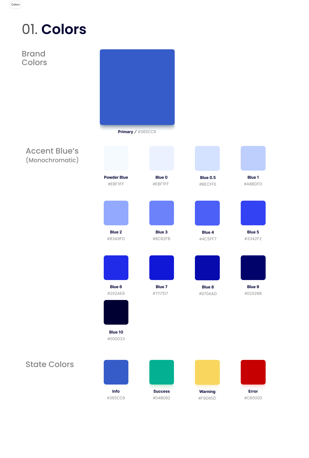
Since the client had no pre-existing brand, we started from scratch and developed everything, including the logo. The discussion allowed for a wide range of color exploration, however ultimately the team lead and I decided it was best for us to keep it monochrome to establish a clean and minimal look. As a result, we created a modern style guide that the client can utilize to their advantage.

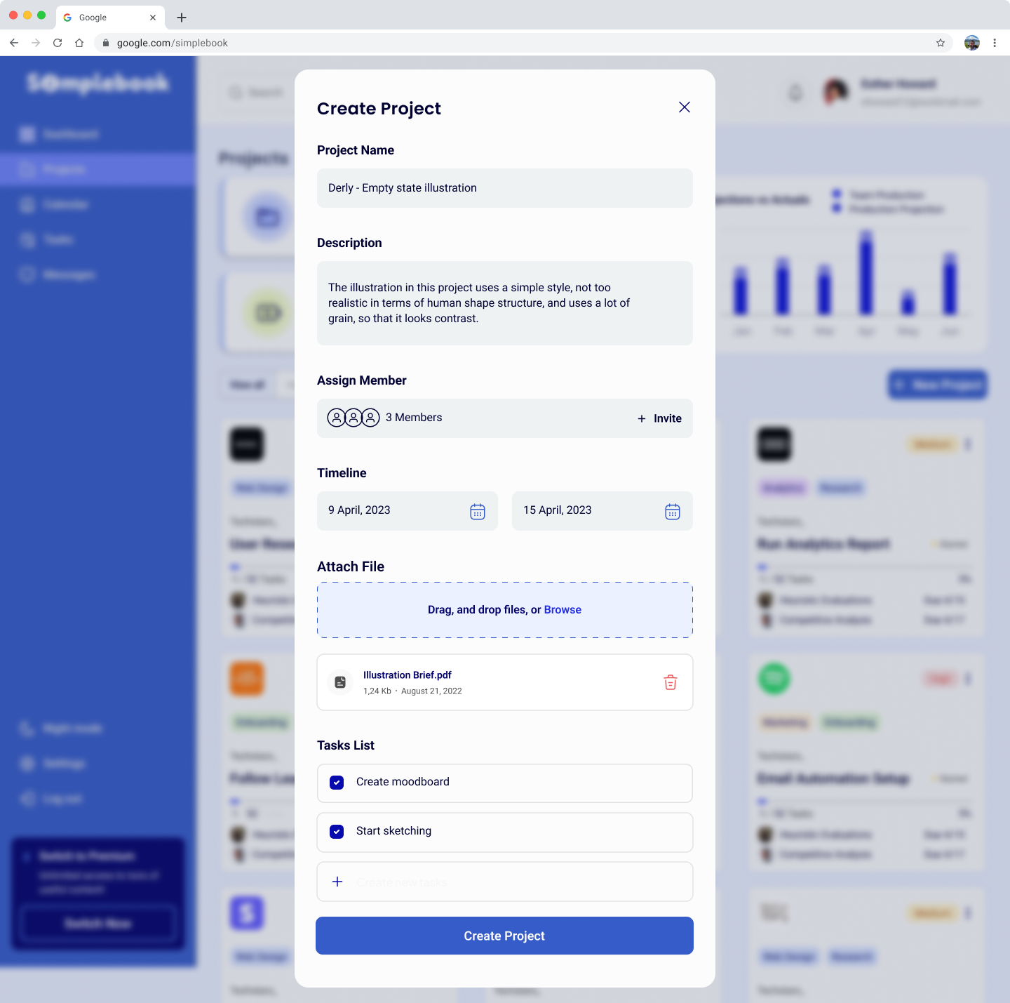
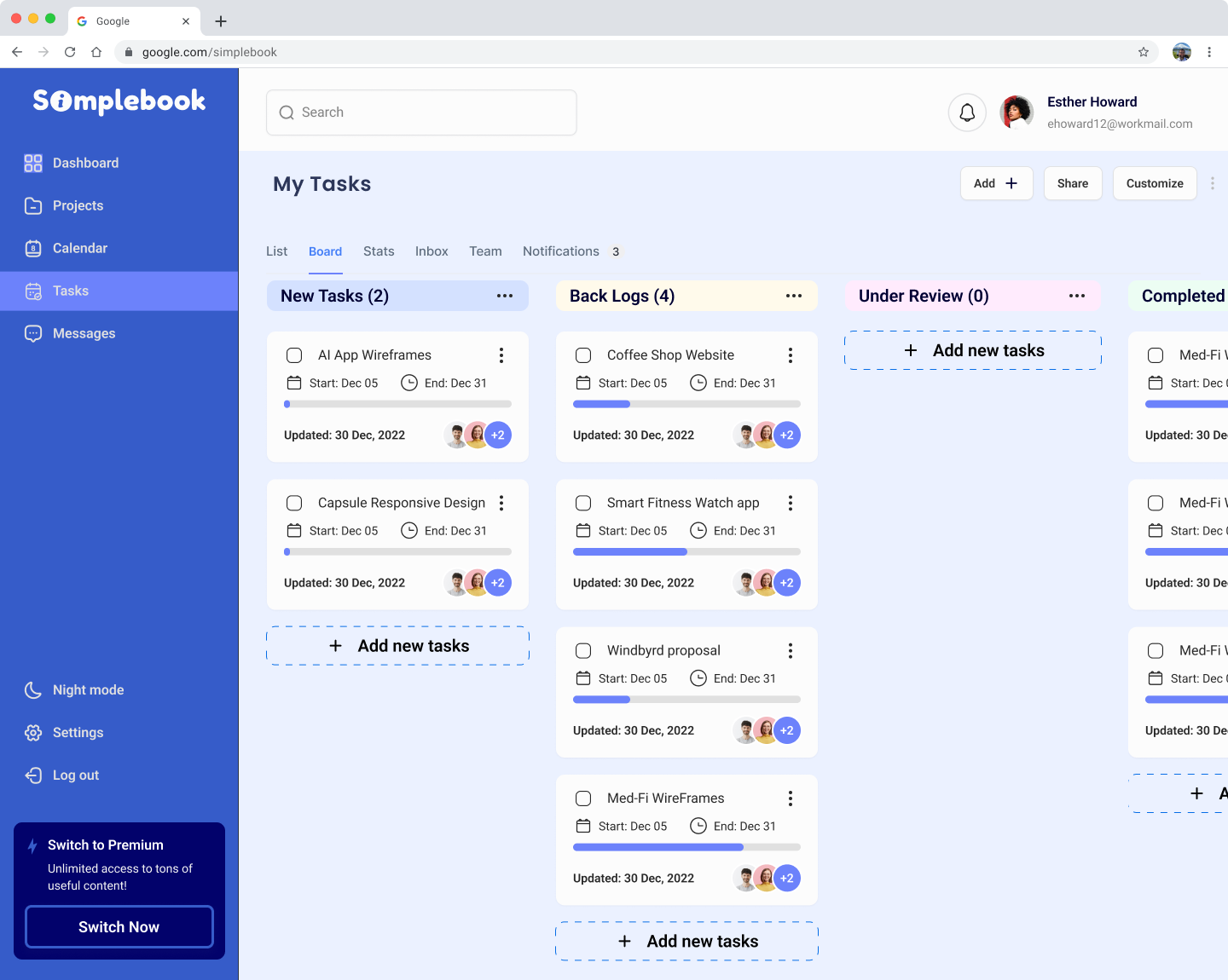
We created three iterations for the client to ensure all stakeholder's voices were reflected in our final design.
Although I primarily focused on the third iteration, we collaborated as a team to develop the final iteration (#1), integrating my contributions such as the team and task lists. While the client appreciated the calendar component in the third iteration, they recommended that it be used as an interchangeable feature rather than a fixed element on the dashboard. We considered the client's preferences and created high-fidelity frames accordingly.
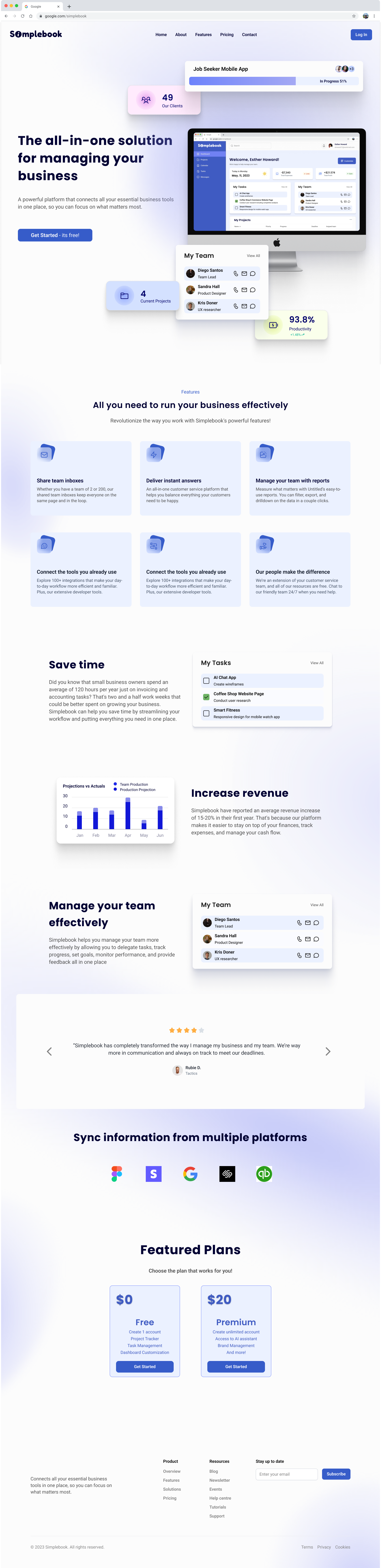
Here is a look at the iteration process I went through while designing the landing page.
While I didn't change much of the layout of the wireframe, I added modern UI flairs to help create a visually stunning page. It was important that the features the platform provided would be easily visible in the hero section, and more in-depth information would be provided further down the page.
Lastly, I wanted to include a clear CTA with pricing cards, so those who were interested could try it out, stress-free!
.png)
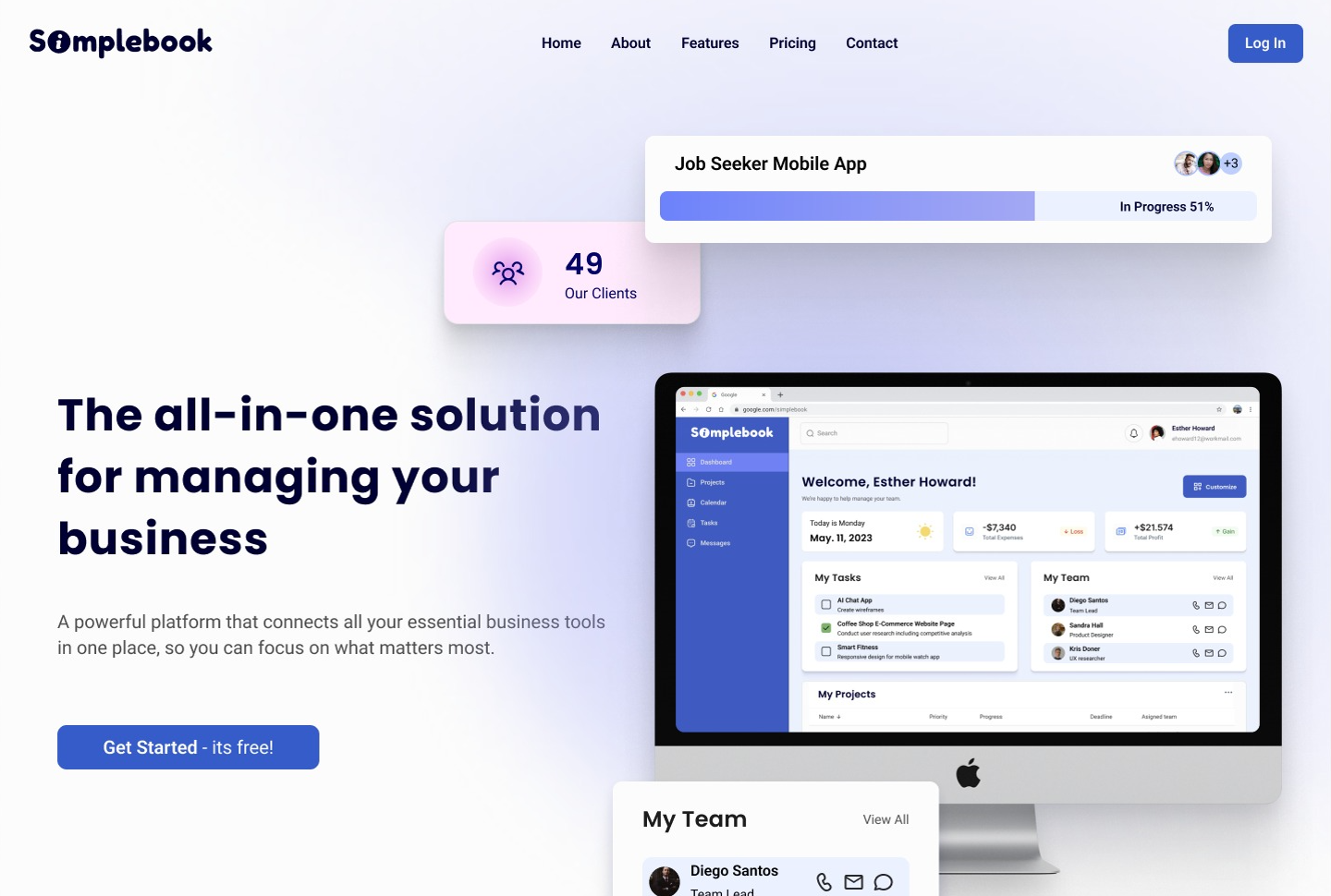
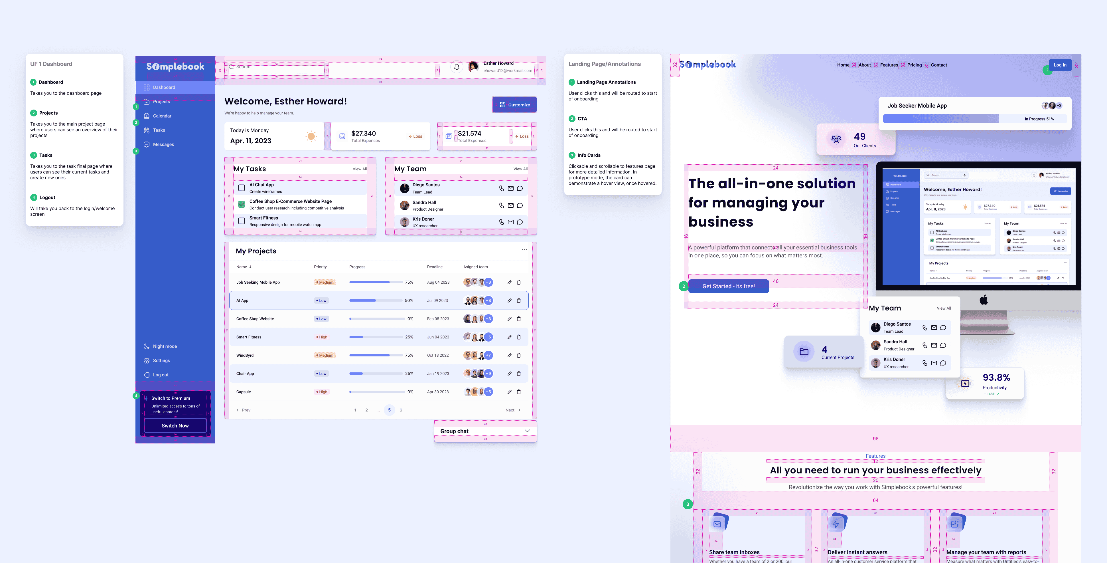
My assignment was to produce a high-fidelity version of the landing page (as seen above).
To optimize the landing page I included:
In addition to this task, I was also responsible for designing high-fidelity components. This played to my strengths since my expertise lies in UI design, with an emphasis on conveying brand identity and emotion through design.
To facilitate a seamless transition for the developers, we made sure to annotate any important notes and measurements. While each team member was assigned to their specific screens to annotate, we collaborated at the end to ensure that all screens were fully prepared for delivery.
This was a true test of my adaptability and leadership skills. I truly enjoyed the challenge of stepping up to support a new team and building out an effective MVP for our client.
Improving our organization and collaboration was an area of growth. When working with a team, I want to minimize confusion and overlap by making sure I'm creating tidy components earlier in the design process. Nonetheless, I am confident that the product we have created will be well-received by many business owners and I'm proud of the work we did!
Our next steps involve prototyping, conducting usability testing, and making changes based on user feedback. After feedback, I'd also like to continue to improve the usability of the dashboard to ensure all users will be able to utilize the tools effectively. This includes allowing for as much customization as possible.